Paylon Landing Page
The challenge with this project was to effectively integrate multiple messages and components into a single cohesive page. Given the complexity of the content, it was crucial to find a way to present everything clearly without overwhelming the viewer. By focusing on the key elements of the brand, I aimed to create a design that not only conveys the intended messages but also resonates with the target audience.
My process began with a deep dive into the brand strategy, which provided a solid foundation for the design. Understanding Paylon's unique selling propositions (USPs) was essential in identifying how best to communicate the brand's value. I analyzed the core aspects of the service offerings, ensuring that each visual element aligned with the overarching strategy. This thorough exploration allowed me to prioritize the most impactful messages that needed to shine through on the page.
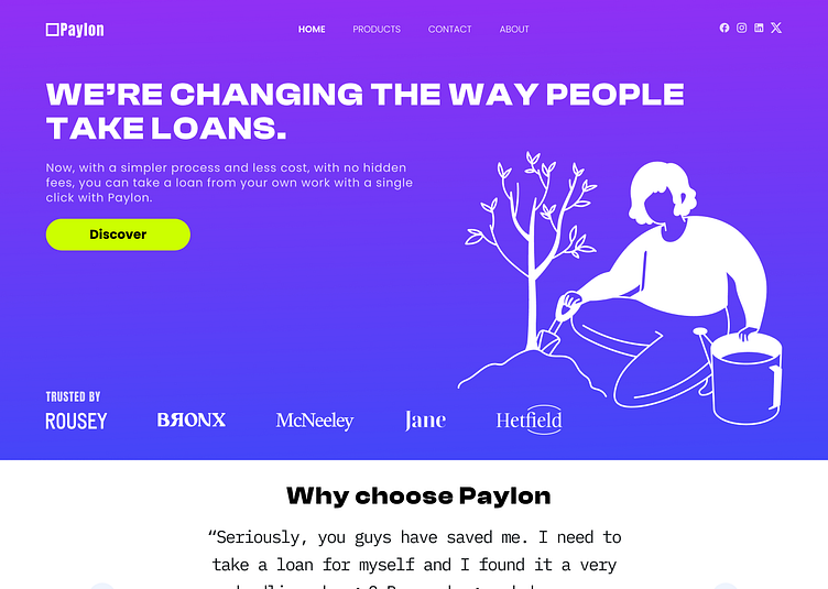
Recognizing that the primary message revolves around the work-based nature of Paylon's services, I made deliberate choices in my design. The hero section became a focal point, where I opted for an illustration that embodies a professional environment. This choice not only highlights the brand's commitment to workplace solutions but also creates an immediate connection with visitors who are seeking such services. The imagery serves as an engaging entry point, drawing users into the narrative of the page.
To further enhance the user experience, I strategically organized the layout to facilitate easy navigation. Each section flows seamlessly into the next, guiding visitors through the various components of the offering. By using consistent typography, color schemes, and visual hierarchy, I ensured that the design remains visually appealing while effectively conveying important information. This thoughtful arrangement helps maintain the reader's attention and encourages them to explore the content more thoroughly.
Ultimately, the design aims to create a holistic representation of Paylon's brand identity while addressing the complexities of its message. By merging the various components into a single, user-friendly page, I hope to provide a compelling experience that informs and inspires action. This project has not only challenged my design skills but has also reinforced the importance of aligning visuals with brand strategy in creating impactful digital experiences.
