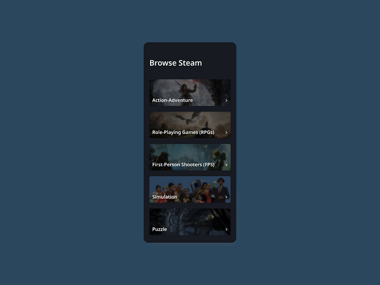
Daily UI Challenge #5 - Category Screen
To enhance my UI skills, I've embarked on a journey to design small components daily. Inspired by Michał Malewicz's "Daily UI Challenge" from Hype4Academy, this project marks another step in my quest for continuous improvement.
Project Overview: For this project, I've focused on designing a category screen for a mobile application. This screen serves as a crucial navigation point, helping users to easily find and explore various sections of the app. I drew inspiration from various online designs and incorporated feedback from other designers on Hype4Academy to create a polished final result.
Category Screen Description: My category screen is designed to provide an intuitive and aesthetically pleasing user experience. Key features include:
Category Tiles:
Visual Appeal: Each category is represented by a visually engaging tile with an icon and a short description.
Accessibility: Tiles are sized and spaced for easy tapping, ensuring accessibility for all users.
Highlighting: The selected category is highlighted to help users keep track of their navigation.
