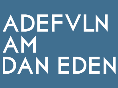
Exchange - a geometric typeface (WIP)
I'm working on a font for personal use that I'm calling "Exchange" - inspired by the likes of Futura, Motor Oil and Governor.
My main objective was to overcome some of the nitpicks I have with Futura, such as the points on A's, V's, N's and M's extending the cap-height and baseline of the font.
This is my first attempt at anything like this, so any advice or tips would be great.
More by Daniel Eden View profile
Like
