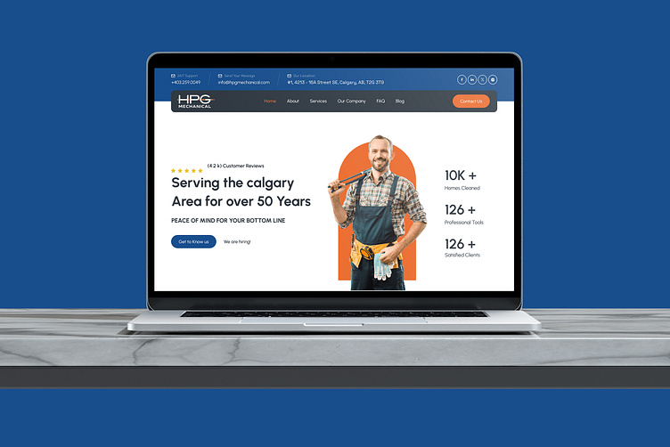
HPG Mechanical Website Redesign
For our redesign of the HPG Mechanical website, we focused on modernizing the user interface and enhancing functionality.
Hero Section:
We crafted a compelling hero section with a strong headline, "Serving the Calgary Area for over 50 Years," emphasizing their extensive experience. The customer review rating and CTA buttons were strategically placed to build trust and encourage user interaction.
Service Highlights:
In the service highlights section, we used clean, visually appealing icons and concise text to clearly communicate key services and achievements. The layout is designed for easy readability and quick comprehension, ensuring users can swiftly find the information they need.
More by WeBetterDesign View profile
Like


