Collect UI #8 Challenge - 404 Page
🧐404 Page🧐
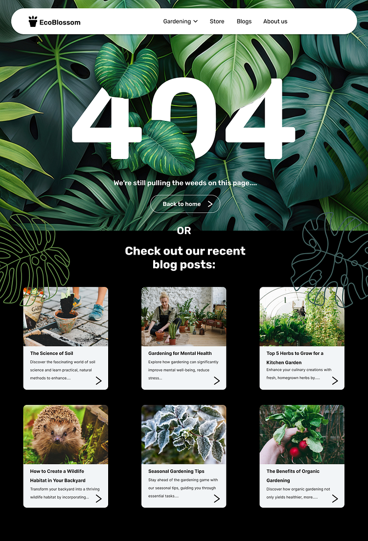
I designed this 404 error page for a fake eco-gardening company. It features a visually appealing and nature-inspired design, with lush green leaves in the background emphasizing the site's eco-friendly theme. The large, prominent "404" text in the center communicates the error, accompanied by a playful message, "We're still pulling the weeds on this page…," suggesting the page isn't available but keeping the tone light and on-brand.
Below the error message, there's a clear call-to-action button labeled "Back to home," directing users to the main page. Additionally, the page offers alternative navigation by showcasing recent blog posts, encouraging users to explore more content.
Below the error message, there's a clear call-to-action button labeled "Back to home," directing users to the main page. Additionally, the page offers alternative navigation by showcasing recent blog posts, encouraging users to explore more content.

