Button
In the realm of design, the humble button stands as a pivotal element. Despite its simplicity, the button's design can significantly impact user experience, making it essential to pay close attention to its states, icon placements, and accessibility features.
Button states
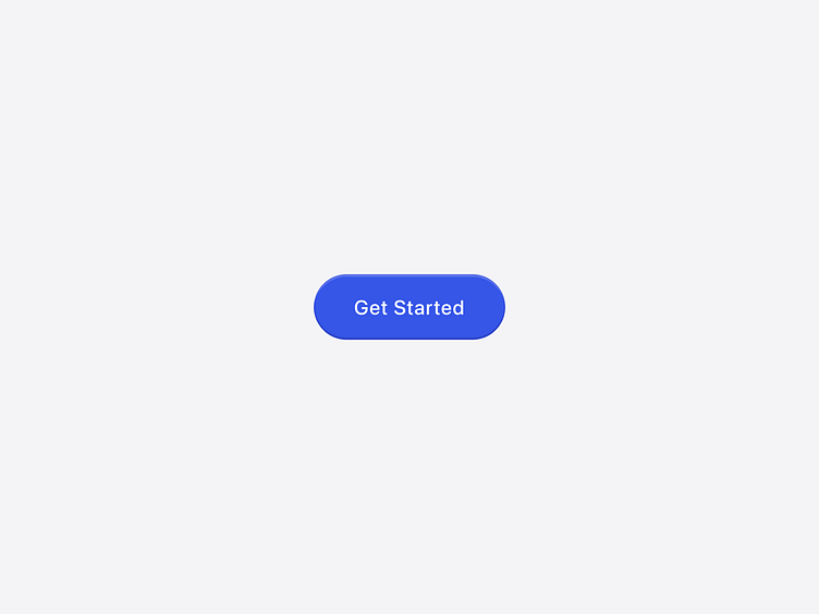
Default state: The default state is how a button appears when not interacting with it. It should be inviting and clearly visible, often with a prominent color that stands out from the background.
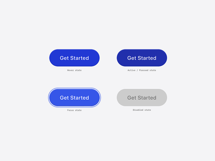
Hover state: When a user hovers over a button, it should visually respond to indicate interactivity. This can be achieved by slightly changing the button's colour, adding a shadow, or altering the border to give a sense of depth.
Active state (or Pressed state on mobile): The active state, known as the pressed state on mobile, shows when a button is being clicked or tapped. It typically involves a more pronounced visual change, such as a darker colour or a pressed effect, to give immediate feedback.
Focus state: For keyboard users, the focus state is crucial. It should have a clear outline or a glow to signal that the button is selected and ready for interaction.
Disabled state: A disabled button indicates an action that is currently unavailable. It usually appears faded or greyed out to differentiate it from active buttons, signalling to users that it is not interactive.
Icon placement
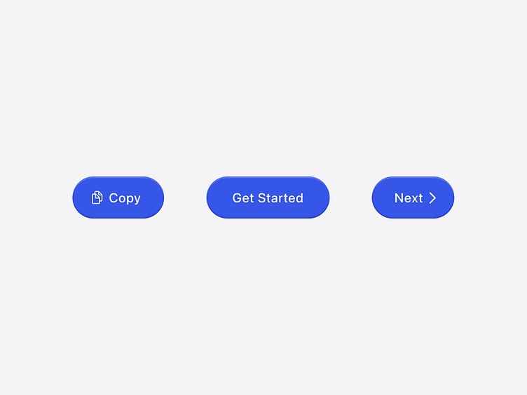
Leading: Placing an icon before the text can enhance recognition and add visual interest. This is especially effective for actions that are commonly associated with a specific symbol, like a magnifying glass for search.
Trailing: An icon placed after the text can guide the user's eye and emphasize the direction of the action. For instance, a right arrow following "Next" clearly indicates progression to the next step.ere...
Accessibility
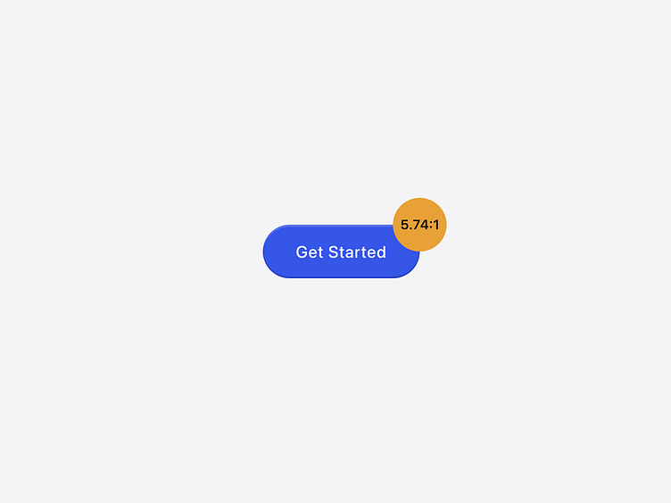
Accessibility is non-negotiable. Buttons must meet color contrast ratios as outlined by the Web Content Accessibility Guidelines (WCAG). This ensures that users with visual impairments can distinguish buttons from the surrounding content. While designing, consider colorblind users by not relying solely on color to convey state changes; incorporate text and icons for clarity.
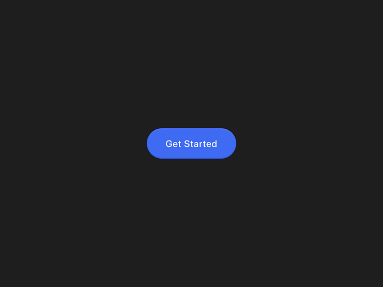
Dark theme
Designing buttons that work well in both light and dark themes is essential. Ensure sufficient contrast between the button and the background in each mode. For dark themes, use lighter shades for buttons and ensure text and icons within the button are legible.