DOUMER BEER | LOGO DESIGN & BRAND IDENTITY
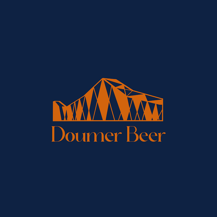
Doumer Beer is a company specializing in the production and trading of beer products such as draft beer and malt beer in Hanoi. The logo design of Doumer Beer features the image of a bridge, reminiscent of the famous Long Bien Bridge in Hanoi. This aligns with Doumer Beer's mission to bring the image of Hanoi closer to foreign tourists. The bridge image is designed using triangles and geometric shapes, creating a solid and modern structure. The use of the Long Bien Bridge image represents connection, sustainability, and history, symbolizing the link between the past and present, reflecting the company's commitment to tradition in business.
The logo uses orange for the bridge image and the "Doumer Beer" text. Orange typically symbolizes creativity, energy, and enthusiasm, while the background is dark blue, providing a sense of stability and professionalism. The combination of orange and dark blue creates a harmonious overall look, expressing dynamism and firmness. The font of the company name "Doumer Beer" is designed with a stylized, elegant, and easy-to-read typeface, creating a strong contrast with the bridge image while conveying a sense of sophistication and quality.
In summary, the logo of Doumer Beer presents a modern and professional image while retaining traditional values and connection during business development.
Designed by Bee Art
-
Client Doumer Beer
Logo Design Project. Logo is designed for Tourism Company in Vietnam.
Copyright© Bee Art. All Right Reserved
Contact us:
• Hotline/ Zalo: (+84) 77 34567 18
• Email: info@beeart.vn
• Website: www.beeart.vn
• Facebook: https://www.facebook.com/BeeArt.vn


