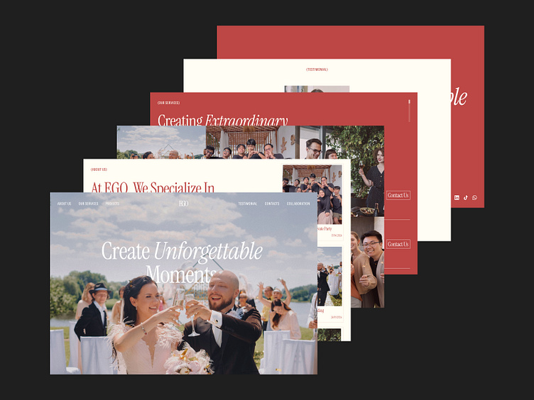
EGO - Event Organizer Landing Page
Objective
EGO, a premier event organizing company, sought a fresh and engaging landing page to better represent their brand, attract new clients, and streamline the user experience for visitors seeking event planning services. The goal was to create a visually appealing, intuitive, and user-friendly landing page that effectively communicates EGO's services, expertise, and portfolio.
Challenges
Brand Representation: Ensuring the design aligns with EGO's brand identity and appeals to their target audience.
Information Overload: Presenting comprehensive service information without overwhelming the user.
User Engagement: Designing interactive elements to keep visitors engaged and guide them through the site.
Key Features
Hero Section: A visually striking hero image with a clear call-to-action button, inviting users to explore EGO's services.
Service Overview: An easy-to-navigate section detailing EGO's key services with icons and brief descriptions.
Portfolio Showcase: A dynamic gallery showcasing EGO's past events with high-quality images and client testimonials.
Interactive Elements: Engaging features like hover effects, animated transitions, and interactive buttons to enhance user experience.
Contact Form: A streamlined contact form with essential fields and a prominent submission button to encourage inquiries.
Outcome
The EGO landing page successfully met all project objectives, resulting in:
Increased Engagement: Visitors spent more time on the site, exploring services and portfolio sections.
Higher Conversion Rates: The intuitive design and clear calls-to-action led to a significant increase in client inquiries and bookings.
Positive Feedback: Users praised the landing page for its aesthetics, ease of use, and informative content.
Brand Strengthening: The design effectively reinforced EGO's brand identity and established them as a leader in the event organizing industry.


