PHO SPOT | LOGO & BRAND

Pho Spot [Logo and Branding Project]
🟢 Logo | Branding | Brand Identity
🟢 Field: Restaurant
🎨 Pho Spot wishes to design a logo: Traditional style
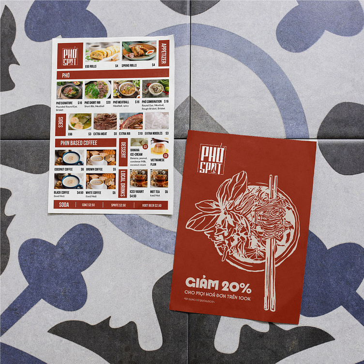
🎨 Kaiza has succeeded in designing the Pho Spot brand logo with a solid, impressive layout. The logo brings a traditional feel with a stylized design that resembles a seal with square corners and the brand name placed inside. The image of the seal implies a commitment to the quality of the brand's products and services. In addition, the letter O in the word SPOT is also designed with the image of a girl wearing a flowing ao dai and a conical hat, this is a typical symbolic image of Vietnamese culture. The main color red represents the passion and enthusiasm of the "Pho cook" - a special Vietnamese dish. Overall, creating a unique and impressive logo that not only represents the traditional style and cultural image of Vietnamese people but also shows the enthusiasm and passion of the brand owner.
Designed by Kaiza
Copyright © Kaiza. All Right Reserved
Contact us:
KAIZA CO.,LTD
• P: 0889 996 399
• E: info@kaiza.vn
• W: www.kaiza.vn
Connect me @ Behance - Instagram - Pinterest