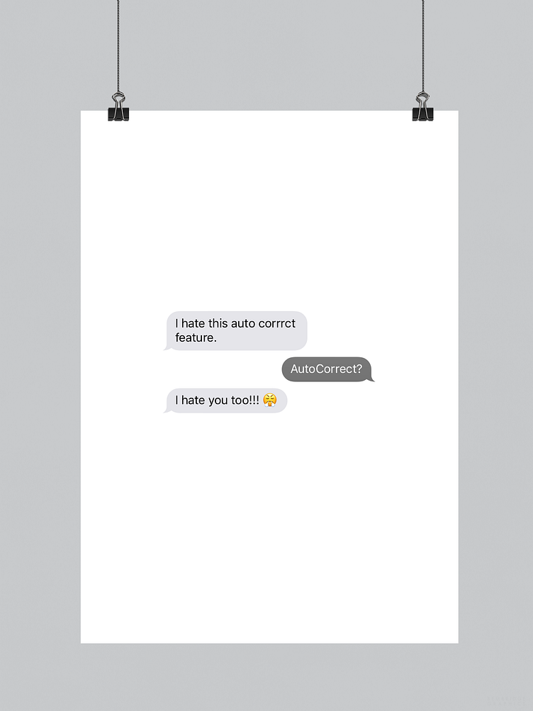
AutoCorrect | Typographical Poster
This project that began in mid July was based around the idea of designing a typographical poster that would reference the frustration people occasionally feel from being “grammar-corrected”, both verbally and through technology, by the way of a visual style that combines minimalism and simplicity together.
To see the full project, be sure to head over to my Behance blog :)
More by Karl Bembridge View profile
Like
