UI/UX Fixes
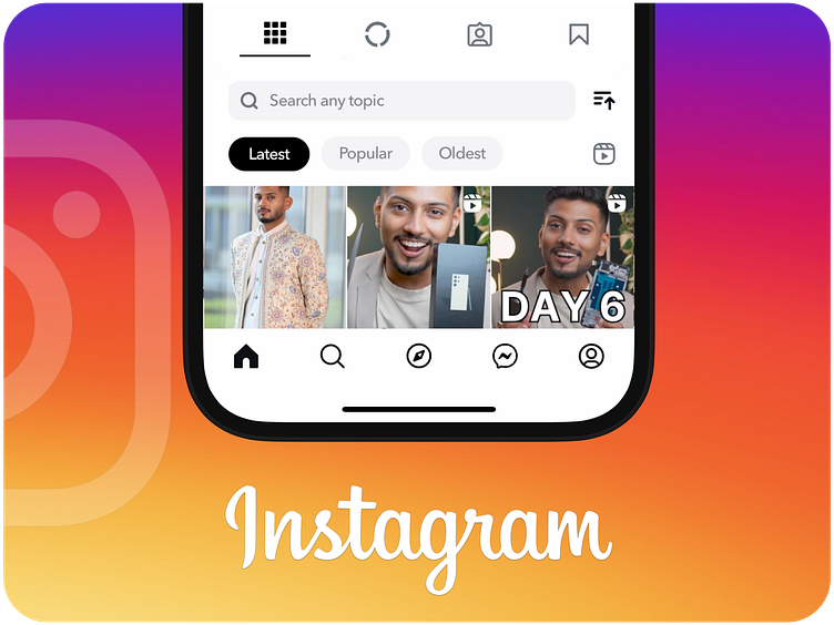
Added a search feature to your profile page so you can quickly find specific content without endless scrolling. Enjoy faster and easier access to your posts!
You can now sort posts by oldest, latest, or most popular. This update helps you easily find the content you’re looking for, making your browsing experience smoother and more organised.
Access your reels directly under the sort options for easier navigation.
Switched the alignment of your profile picture and bio to horizontal for better readability. This new layout improves clarity and organisation.
All story posts are now grouped besides your main posts for a clearer view of your content. This update brings everything under one roof, improving clarity and organisation.
Moved the Saved button from the More section to your profile page for easier access. Since it’s a frequently used feature, this change improves visibility and convenience, allowing you to quickly access your saved content.
The search icon now directly opens the search function, while the explore tab has a distinct new icon. This update eliminates confusion and helps you easily distinguish between searching and exploring content.
Moved the Messages icon to the bottom navigation bar and replaced the Reels icon. Since Messages is used more frequently, this change makes it more accessible. Enjoy easier access to your most-used features.
Replaced the Create icon with the Explore icon. The Create icon now resides on the Account page, where it aligns with content management and future uploads. This change enhances navigation by better reflecting the purpose of each page.
Added a pause icon to videos, allowing you to pause playback easily. This feature is especially useful for taking screenshots or reviewing content without interruptions. It enhances video control and improves your overall viewing experience.
Grouped Reels and Explore into a single page. Since both feature random content, combining them makes it easier to browse and discover new content efficiently. Enjoy a more streamlined and engaging experience!
Streamlined the commenting process by removing the additional option to comment. Now, you can simply click the comment icon to add comments directly. This update reduces unnecessary clicks and simplifies your commenting experience.
Instagram's "Save" button should instantly save a post with a tap, while holding the button would bring up the collection options. This would reduce interruptions and make saving posts faster and more convenient.
Added two tabs to your feed: one for posts from your followers and another for suggested content from Instagram like Thread. This change allows you to easily view updates from your friends and manage suggested posts separately, making it simpler to stay connected with your circle.
Introducing gaps in the gradient border of the profile picture. This feature, similar to WhatsApp status, lets you see how many stories have been uploaded at a glance, improving navigation and clarity.
Share Profile moved next to the username and changed from text to an icon for easier access and a cleaner look.
Edit Profile moved to the Settings section as it’s not frequently used, streamlining the profile interface.
I don't know why Note feature exists!
Merged the gallery and camera icons into a single gallery icon. Since both functions allow you to upload photos.
Moved the sticker feature into the emoji section, as emojis are used more frequently than stickers.
Web
Moved the dark mode toggle to the More section for easier access. Since it's the only option available under switch appearance.
Changed the colour of the logout option from white to red. This update makes the logout button more noticeable, ensuring it stands out and is easily identifiable.
Instagram Version - 335.1.8
Instagram Version - 335.1.8


