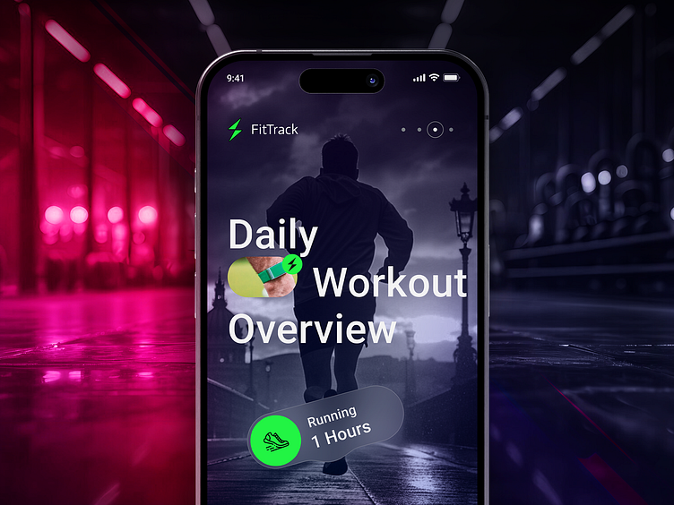
FitTrack - Fitness app design
FitTrack is a fitness tracking app designed to provide users with a seamless and engaging experience to monitor their workout routines, progress, and fitness insights. This case study explores the rationale behind the design choices, including the use of color, icons, and a dark theme.
This screen provides detailed statistics of the user's workout, making use of clear icons and a dark theme to ensure all information is easily readable. The green progress indicators provide motivation by showing the user's achievements.
Color Choices
Primary Color (Green): Used for active elements and key highlights (e.g., running icon, text highlighting "Running 1 Hour").
Green is often associated with health, growth, and activity, making it ideal for a fitness app. It draws attention to important information and interactive elements.
Dark Background: Provides high contrast and reduces eye strain, making the app comfortable to use in various lighting conditions.
The dark theme enhances the visibility of the bright green highlights and other icons, ensuring they stand out to the user.
Icons:
Clock Icon: Represents exercise duration.
Universally understood symbol for time-related metrics.
Moon Icon: Represents rest duration.
Simple and clear representation of rest or sleep.
Calendar Icon: Indicates the active streak.
Helps users quickly understand their ongoing commitment to fitness.
Settings Gear Icon: Provides access to settings.
Standard icon for settings, ensuring familiarity.
Design Elements:
Main Metric: 760 kcal
Left Box: 130 Minutes Exercised
Right Box: 170 Minutes Rest
Bottom Left: 8 Days Active Streak
Bottom Right: Settings Icon
Color Choices:
Green Dots: Indicate progress towards the goal (e.g., calorie burn).
Green provides a clear visual cue for achievement and progress.
Bright Icons (White): Stand out against the dark background.
Ensures important information is easily visible and quickly recognizable.
This screen provides detailed statistics of the user's workout, making use of clear icons and a dark theme to ensure all information is easily readable. The green progress indicators provide motivation by showing the user's achievements.
This screen offers in-depth insights into the user's fitness journey, using a combination of clear icons, color-coded data, and a dark theme to enhance readability and user engagement. The use of green highlights helps in quickly identifying active elements and important information.


