Weight Loss App - A Case Study
Design Lead
User Journey, Wireframes, High Fidelity, Prototype, Design System, Client Presentation
Initially, the client asked for a few tweaks to their existing UX. They weren’t exactly happy with the current design but didn't know exactly what they wanted either. After reviewing all the screens, discussing the scope, and showing a few screen mockups, it became clear that a complete redesign was the best approach instead of just making small fixes.
The existing design had too many mistakes. It lacked a unified look, clear structure, and visual appeal. Some elements didn’t fit, didn’t make sense, or were simply unnecessary.
Goals
After sitting down with the client and getting user feedback, we came up with three primary goals.
Streamline the App
Remove all unnecessary elements to help users focus on their weight loss journey. Simplify the content and graphics so they're easy to understand. Make sure the calls to action are clear, concise, and easy to access.
Improve Functionality
Use logical methods to create improved user journeys. A focus on ease of use in all actions. Design elements that are consistent and familiar, allowing users to understand the information easier.
Improve Visual Aesthetic
Create a clear visual and structural hierarchy. Use color and contrast to highlight important elements, enhancing the user experience. Space out content to prevent users from feeling overwhelmed. Develop a design system that is simple to use and easy to adapt.
Deliverables
After the goals were created. We were then able to create deliverables.
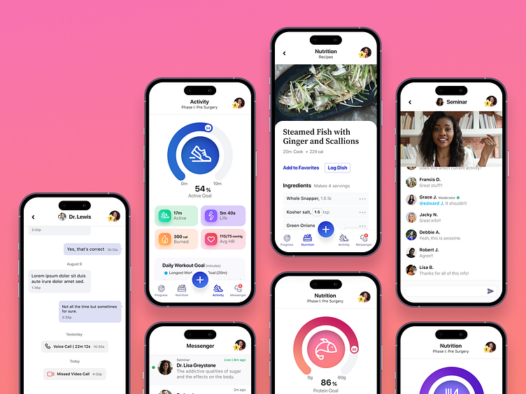
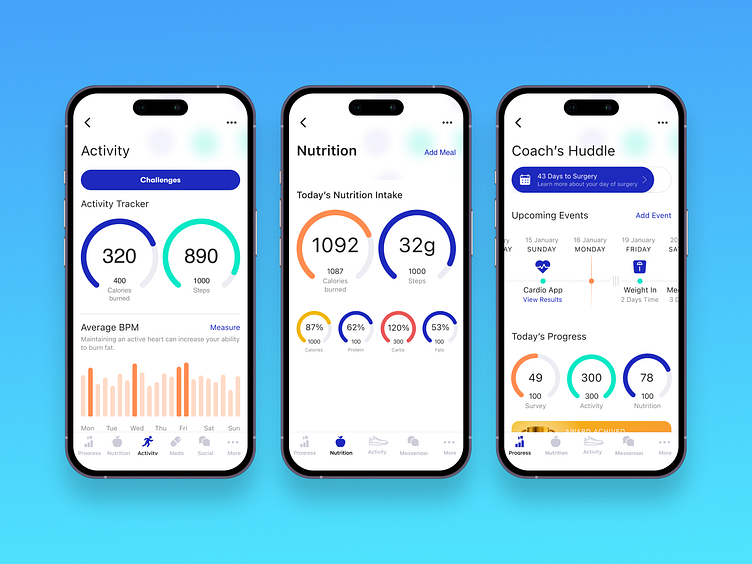
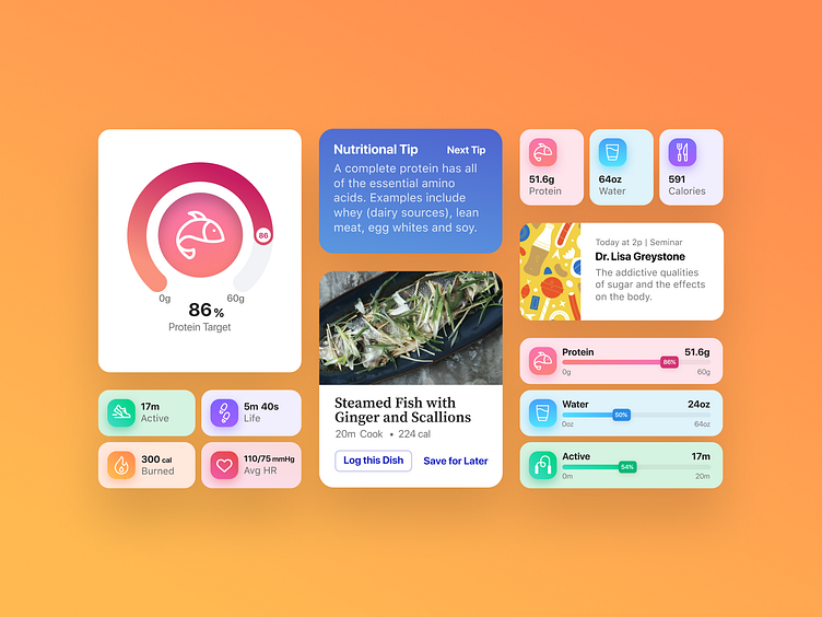
• A fully redesigned interface with improved functionality and visual aesthetic.
• Enhanced user flows and interactions that are focused on ease of use.
• Simplified features and content that supports users in their pre and post-surgery health management.

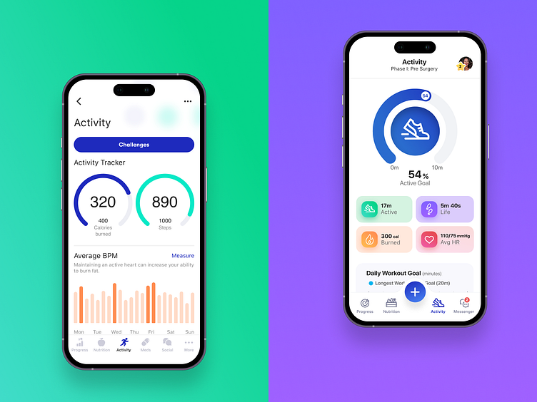
Outcome
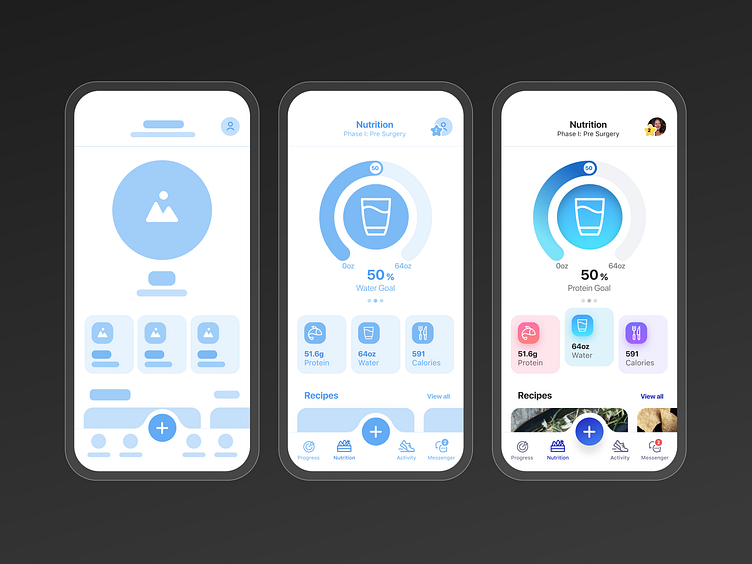
The client was thrilled with the results. Users loved the simplified content and easy-to-use navigation. They appreciated the use of color and the repeated dial design. They mentioned that it felt familiar and was easy to understand, even though it was new.
It started with an existing app that was cluttered, hard to use, and no visual design direction. It ended up simplified, intuitive, and visually appealing.