Back Design


Some people make fun of Apple for having a boring camera design since the iPhone 11.
Apple has only four elements on the back. Camera and Flash, Logo, Colour & Bump Glass
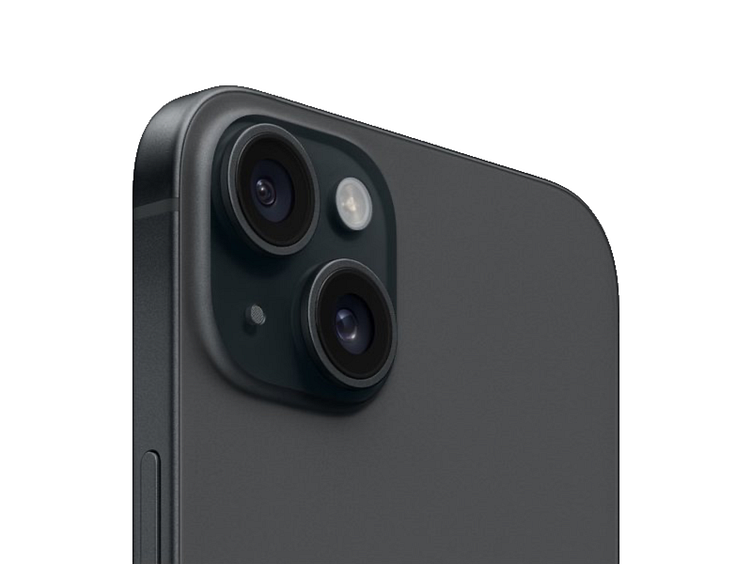
1. Camera Setup
We can't change the camera's color because black reduces reflections and glare, improving image and video quality.
The camera's round shape allows lenses to focus light better, making pictures clearer and less distorted. Placing the camera on the left suits right-handed users, reducing the chance of fingers covering the lens and aiding landscape photography.
Separating camera lenses is impractical as grouping them saves space and integrates multiple functions like wide-angle and telephoto. Apple's consistent, minimalist camera design maintains brand recognition and cohesion.
2. Logo
The central placement of the Apple logo is crucial for balance and symmetry. Moving it to the top or bottom, left or right would disrupt the visual harmony of the design. It might make everything look messy and feel less comfortable to hold.
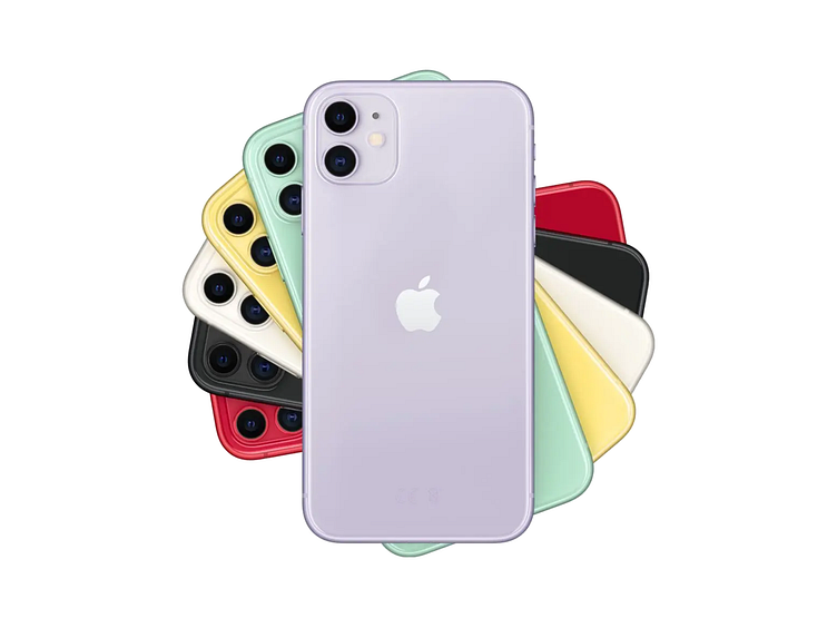
3. Colour
Apple never fails with its color choices. Each iPhone release introduces a carefully curated selection of colors that reflect current trends and appeal to a wide range of users. From classic options like black, white, and silver to bold choices like Product (RED), midnight green, or Pacific blue, Apple's color palette showcases versatility and style.
4. Bump Glass
Apple uses rounded rectangles across its product lineup Examples include the iPhone, Apple Watch, AirPods case, iPad, app icons, and accessories like adapters and even polishing cloth.
Using similar shapes across products helps create a unified brand identity.
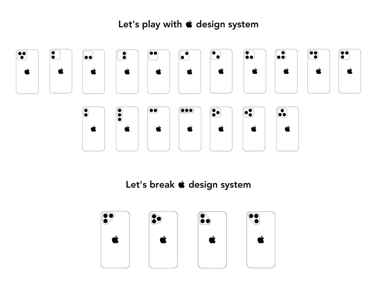
If all three cameras on the iPhone were aligned horizontally, it would resemble the design of the Samsung S24.
iPhone - 2023