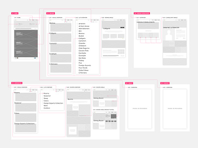
Hold It Website UX Flow
Early website flow for Hold It Contemporary Home. There was still a lot of things being figured out at this stage (like language/naming conventions and navigation), but wanted to start visualizing how the user might navigate the core content of the website.
Credit @Tavish Calico for his expert direction and collaboration
More by Grizzly View profile
Like


