Mission Kids - Unused
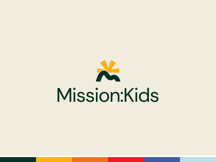
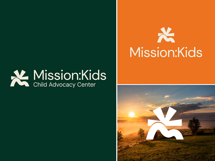
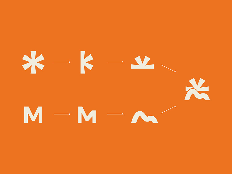
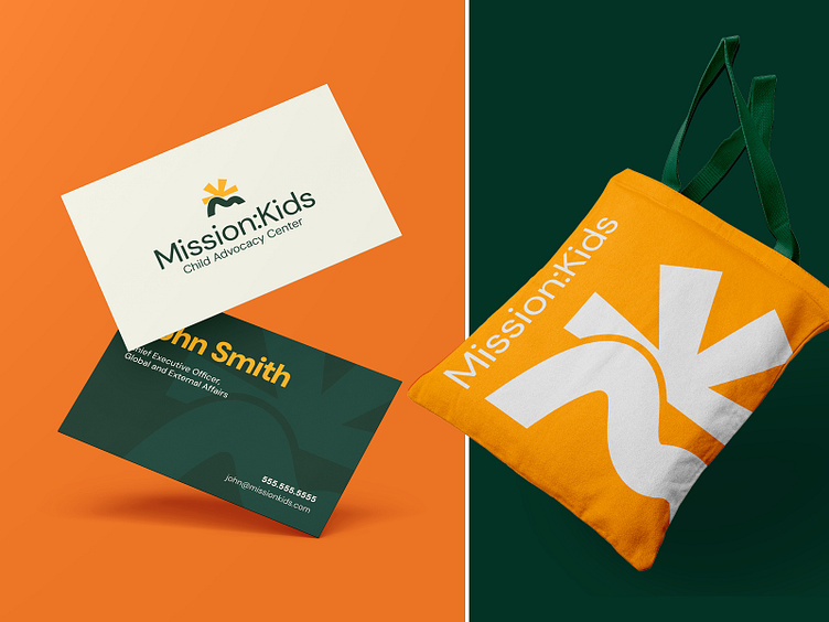
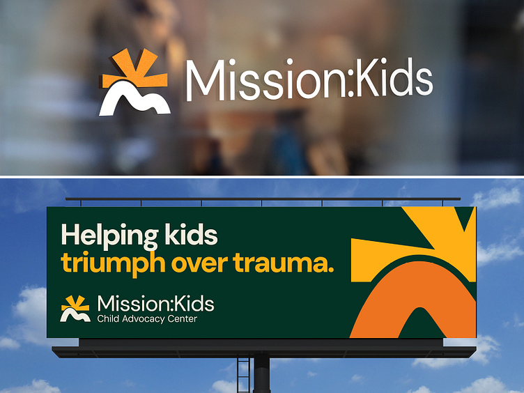
This was an unused concept for a child advocacy center. They specialize in helping children of abuse get the help they need, and begin to heal. The idea came from Mission Kids being a light, and a beacon of hope for kids. For the icon, the 'M' of 'Mission' became the hills, and the 'K' of 'Kids' was built from an asterisk in the brand font - DM Sans, and was to be the sun/beacon atop the hills.
Copy in billboard written by Macy Muirhead at ICGADV.
