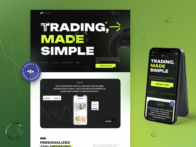
Charty easy trading Website
In the realm of digital trading, the Chartry project embodies a fresh approach to simplifying complex processes. By employing an electrifying green and stark black color scheme, the design not only grabs attention but also establishes a vigorous, dynamic vibe that resonates with the energy of modern trading 😃. This project showcases how thoughtful color choices can enhance the functionality and aesthetic appeal of an app, making financial trading engaging and intuitive for users of all levels🌟.
The selection of typography in this project is particularly noteworthy. By integrating bold, modern fonts with clear and crisp lines, the visual text supports the overarching theme of simplicity and efficiency. Each design choice, from the weight of the font to the spacing of the text, was meticulously planned to ensure optimal readability and to convey a sense of reliability and professionalism 📈.
Furthermore, the user interface was crafted with the user's journey in mind, prioritizing a seamless experience from learning to trading. Innovative features like real-time graph dynamics and personalized trading dashboards were developed, each designed to not only meet but exceed user expectations in terms of usability and performance. The design successfully merges technical functionality with stellar aesthetics, providing a platform where users can engage, learn, and excel in their trading endeavors effortlessly 😊
Let's create something amazing together! 🤗


