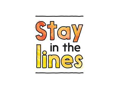
Stay in the Lines - Logo Design 1 v2
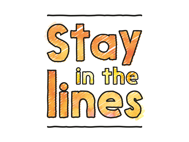
I've tweaked the "in the" lettering. In black it stood out too much and distracted.
Although I liked logo 2 I think logo 1 relates to my project more (Bespoke Colouring Books). I've had a play around with animating and quite like this ever changing scribble effect.
I like the idea that the colours used change seasonally and not have one clear colour palette other than black and white.