Epic Battlenet Redesign: Unleash Your Gaming Potential 🎮
✨ Fantastic Visual Appeal
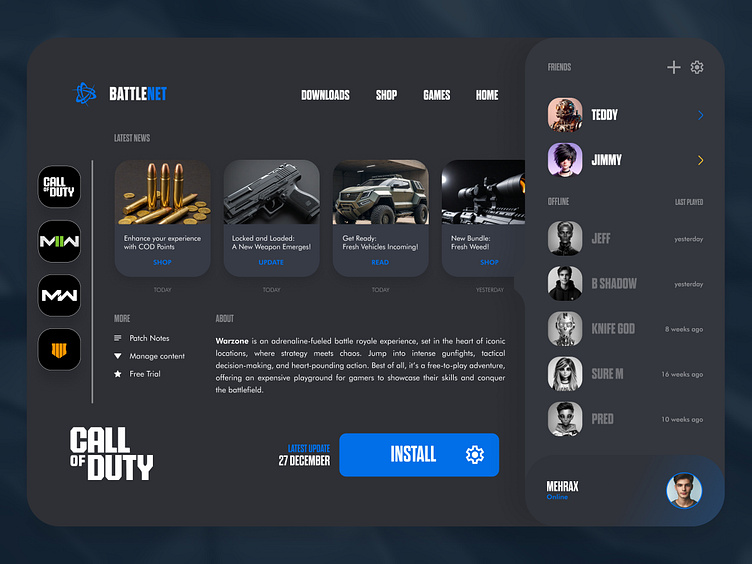
The redesigned Battlenet website looks fantastic! I put a lot of effort into ensuring that the visuals are captivating and align perfectly with the gaming theme. This redesign brings a modern and dynamic look to the site, making it more attractive to users.
Original website:https://us.shop.battle.net/en-us
🎨 Unique Alignment and Structure
For the redesigned Battlenet website, I focused on creating a unique alignment and structure that stands out. The layout is not only visually appealing but also ensures that users can navigate the site effortlessly. This distinct approach enhances the overall user experience and keeps the design looking fresh and engaging.
🖌️ High-Fidelity Wireframe Magic
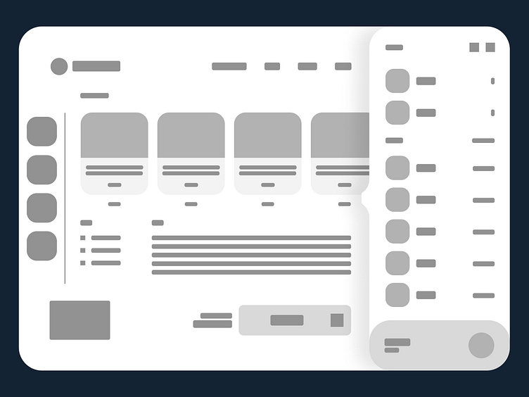
I created a high-fidelity wireframe for the design, providing a detailed blueprint for the final website. This wireframe was essential for planning and visualizing the layout and functionality. Comparing the wireframe to the actual design helped me make the necessary adjustments to achieve the best possible outcome.

🔍 Wireframe vs. Reality: A Perfect Match
I meticulously compared the high-fidelity wireframe to the actual design to ensure consistency and quality. This comparison was crucial for identifying any discrepancies and making necessary adjustments. By doing so, I ensured that the final design stayed true to the original vision while also improving upon it where needed, resulting in a seamless and polished user experience.
💻 iPad Mockup Showcase
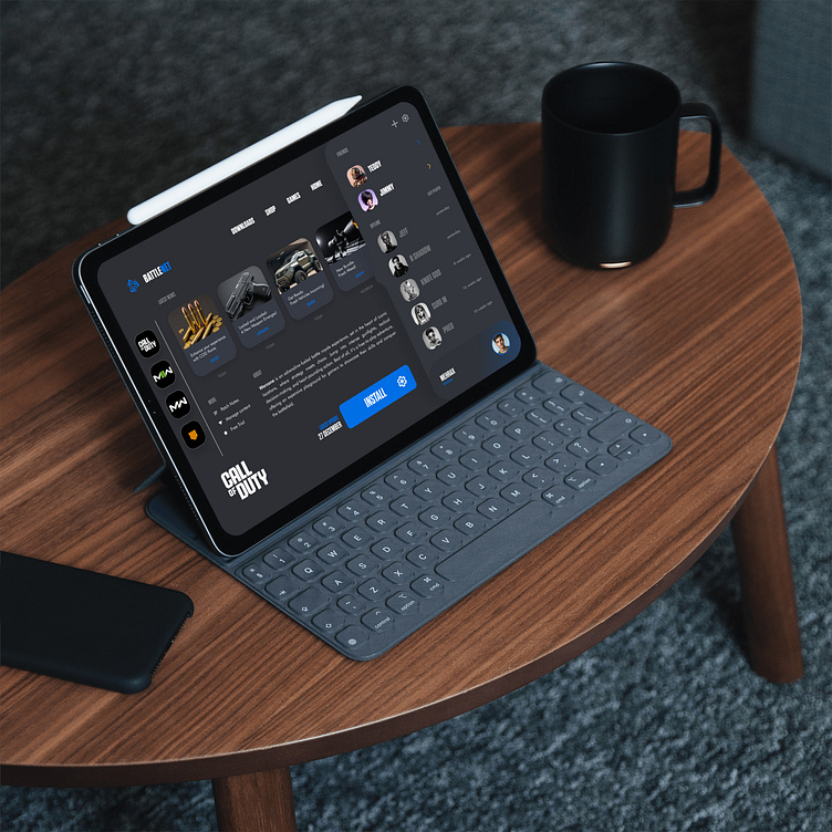
To showcase the redesigned Battlenet website, I developed a MacBook mockup. This mockup offers a realistic view of how the website will look and function on a iPad, providing a clear idea of the user experience across different devices.
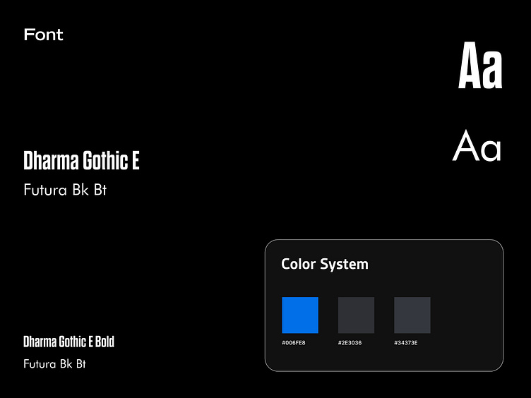
🎨 Vibrant Colors & Bold Typography
For the design, I selected a vibrant color palette of Bright Blue, Gunmetal, and Tuna. These colors create a striking contrast and a visually appealing interface. Paired with the fonts Dharma Gothic E and Futura Bk Bt, the website achieves a modern and bold look, ensuring both readability and style.
