Data viz! Charts, cards and widgets on a Dashboard
🎯 The goal
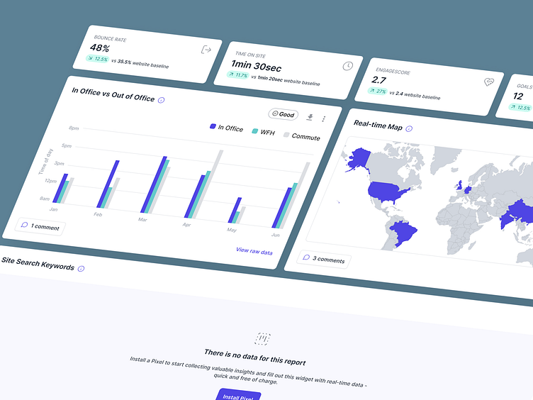
To design some widgets for our client's Marketing and Creative Media Analytics Dashboard, using their brand colours and updated Design System.
💭 The challenge
Our client's UI spec described what we wanted to see on this Dashboard and for what purpose (from the client's POV), but we as designers had to help decide on how to present the data (what data component do we pick? Or is it some other type of UI element, like a series of cards?) and how to easily digest what is being shown (what do we show at a high-level? What needs drilling down to "see more"?)
👨🏻💻 The outcome
Some slick, modern-looking widgets for our Analytics dashboard, packing in a lot of info in a small, easy-to-follow space: the most important data at a glance, with the ability filter through more info and for the ops team to leave comments for their clients.
What do you think? 👀
Work with us!
UserActive is a product design agency for B2B SaaS. We’re on a mission to help SaaS Founders create meaningful products users love.
Book a call 👉🏼 www.useractive.io