Fish-Cherie brand identity
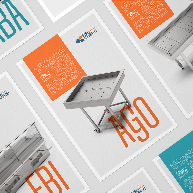
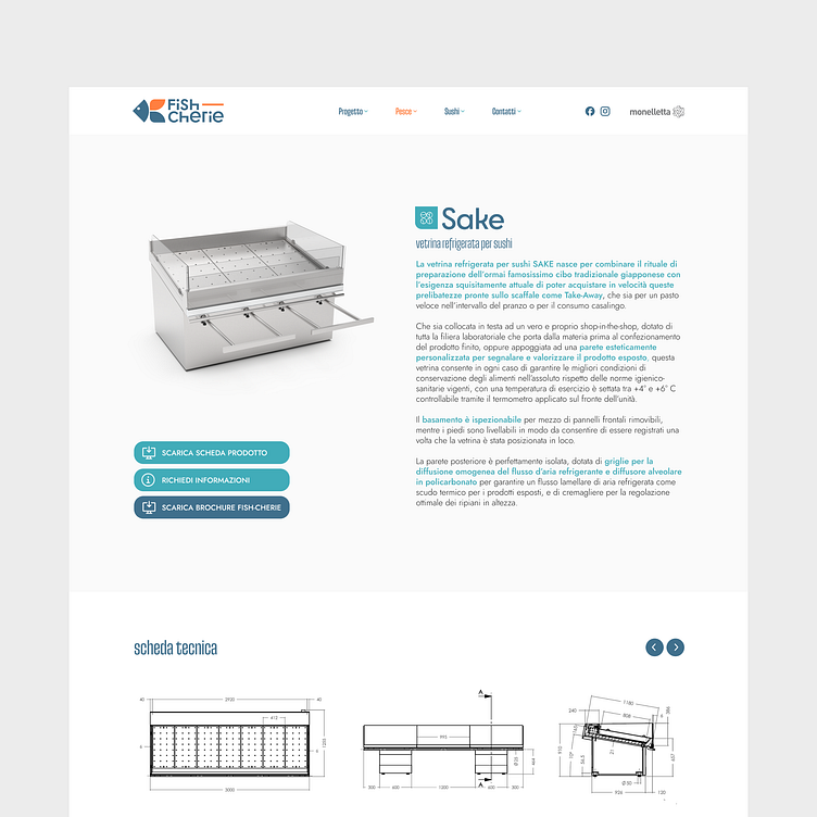
Enter your text here...Need: create the coordinated image for Fish-Cherie, the new line of refrigerated displays intended for large-scale retail trade of the Monelletta company, a historic brand in the world of design and manufacturing of stainless steel products.
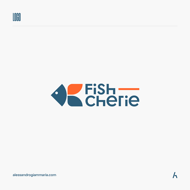
💡Logo design: through the use of simple shapes such as square and circle I synthetically represented a fish whose fins recall the petals of a flower. In this way I managed to combine the two key concepts that the client wanted to convey.
The choice of a synthetic pictogram was also desired for the customer's need to apply the logo on individual products made of stainless steel, therefore with structural constraints for possible processing of the surface for the application of the logo
🔤 I chose a very schematic typography that carried forward two concepts: on the one hand the planning and on the other through a processing of the H and an accentuation of the line, I wanted to synthetically represent the display, i.e. the intended use of the products made .
The H and the line, deliberately elongated to balance the naming, are intended to represent the display stands for which Monelletta and Fish-Cherie are known.
🎨 The chromatic choice wants to carry forward, through the use of blue, the history of the company and the inclusion of the color orange wants to underline the development and progress of the company's design and implementation.
Complete work: https://alessandrogiammaria.com/works/art-direction/fish-cherie/