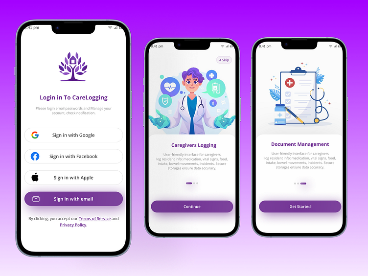
Health Care App Onboarding Design
Project Details
It is a caregiver app where users find doctors or nurses to help their children especially old people who need extra care. In this project, the Client is suffering from onboarding issues. Also, they have an old user interface with many user issues and break UX accessibility rules. In this scenario, the client wants a redesign and wants to solve this user issue.
My Roles
I am a UI UX designer with more than 6+ years of experience. I have completed dozens of projects including Mobile apps, Websites, Dashboard, Systems, POS, and Fintech product design.
My Approach
In this project, I conducted research using valuable user research information to identify pain points and issues. Additionally, I analyzed competitors to gain further insights. By gathering all this information, I was able to redesign specific pages and address the user problems I discovered.
Problem Statements
Messing with information isn't a great approach to explaining the benefits of an app. It can backfire and confuse users
relevant illustration missing that distracts the user
Brand color messaging is all about using color psychology to communicate your brand's personality and values to the App audience
break UX accessibility rules ( including contrast, clear fonts, and providing alternative text descriptions for images and non-text content)
Navigational and Visual Hierarchy issues
Login complexity refers to the difficulty of creating and remembering a login credential, typically a password.
Problem Solutions
Writing relevant information about an app like how the user gets benefits from this app
Using relevant illustrations to make it more informative and reference this app's purpose.
Using color psychology to communicate your brand's personality and values to the App audience
Fixing contrast, font clarification, and removing alternative object
Fixing this login screen by adding more ways to sign up like Facebook, Google, and Apple that can help users easily sign up also added a password remember option that can help the user remember their password
Conclusions
Following prototype submission, the client conducted user testing to ensure a smooth onboarding experience. While minor adjustments were made based on user feedback, the overall user problems were successfully addressed.
