Planet themed typography project
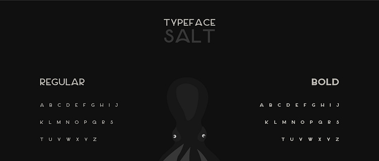
When I underwent with this personal project I had to find a suitable font towards my chosen planet, which in this case was Saturn. I had to find a specific style that I felt captivated the essence of what defines the planet, without a doubt it's the rings. So, when I came across the font called Salt and saw that it's (a) letter was curved, an idea sparked in my mind.
The color scheme had to be considered thoroughly. The color palette consisted of neutral beige like colors, with a few shades of brighter and darker variations. So, once I was able to find the right set to use, I was ready to move on to the experimentation phase.
I was mainly focusing on the letter (a) since I knew that's where the main design element will take place. So, I did a few variations to see what I could produce while have a reference picture of the Saturn next to the experiments.
The two end results I ended up with.


