P&O Australia Refresh - App Concept
Ever had a family member ask you to revamp an app? That happened to me recently. During our usual Sunday chat, my Mother mentioned she wanted to go on a cruise but was put off by the high prices. She ended with, "Have you seen the P&O Australia app, David? It’s absolutely useless.”
Curious by this, I checked it out. With a 2.3 star rating and reviews like "Makes you remember your last cruise as an IT glitch”, I was definitely intrigued, so I decided to sit down and give it a little love.
I started by pulling prominent colours from their website and sticking with their Faustina serif typeface. This font, like many serifs, requires tweaking to work well with icons and screen layouts. It’s quite a difficult typeface to work with, nonetheless I was up for the challenge.
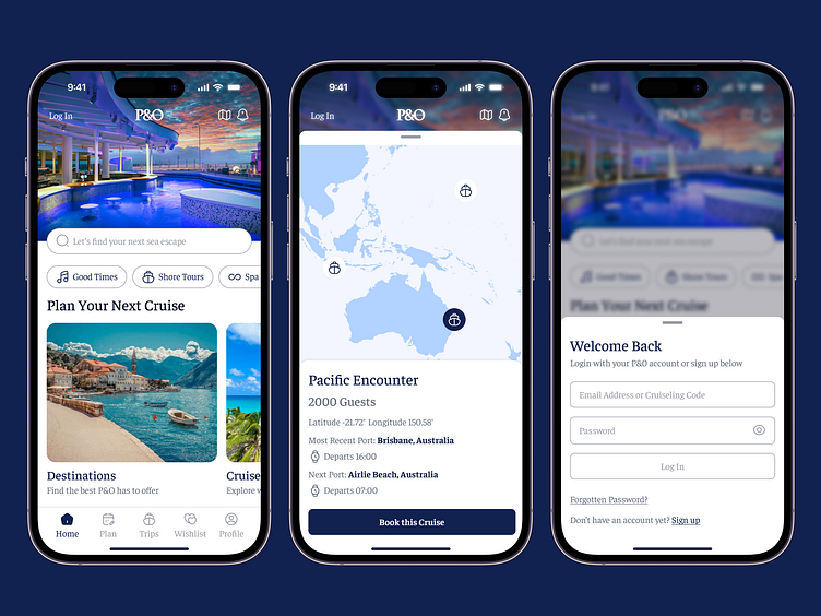
I revamped the home tab with a clear search bar, prominent filters, and beautiful photography reflective of what P&O Australia have. I also thought a wishlist in the tab bar, instead of that experiences section, could be a nice way for users to save their favourite cruises that they may come across in the app. It’s also good for retention, given you can remind users to potentially book these.
For the map of cruises, I included a way to see information clearly and added a "Book this Cruise" button for if you wanted to “jump” on one, and to round it off to a 3 screen redesign, the login screen also got a refresh with some copy and layout tweaks with the use of a modal.
While this app would require serious research, cruise understanding and likely trade-offs of what P&O Australia would want users to be doing every time they open the app, it was fun to see what I could come up with from their original brand.
This redesign was challenging, but the true test I guess is if a Mother likes it.


