Rehabilitation & personal training branding
Thrilled to unveil the fresh and dynamic logo crafted for Marina Mantali, a personal trainer specializing in rehabilitation and athletic performance.
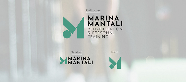
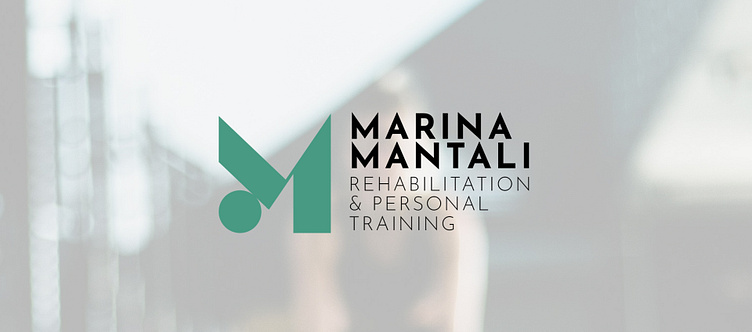
The logo is a harmonious blend of elements that represent Marina's expertise and dedication. The abstract combination of a yoga stretch pose, a ball, and the letter M captures the essence of flexibility, strength, and personalized training, key aspects of her practice.
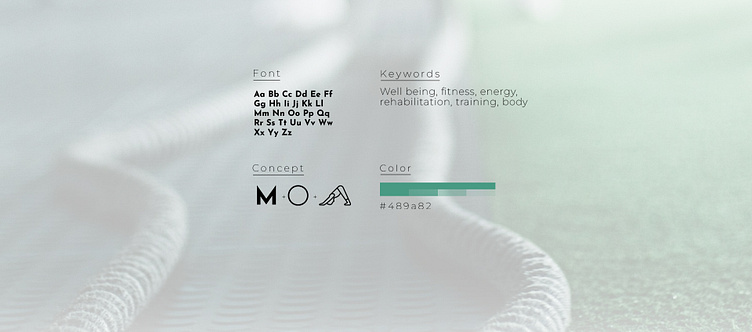
Designing this logo went beyond the artistic process, it involved in-depth research into Marina's field. Understanding the principles of rehabilitation, the nuances of athletic performance, and the importance of a holistic approach were crucial in creating a brand that truly reflects her professional identity. Every curve and line in the logo is thoughtfully designed to symbolize the balance and synergy Marina brings to her clients' journeys. The integration of the letter M, the first letter of both her name and surname, adds a personal touch, making the logo uniquely hers.
Creating a brand in the health and fitness industry requires more than just design skills, it demands a deep understanding of the theories and practices that underpin the field. This logo is a testament to that comprehensive approach, embodying the values and expertise that Marina Mantali stands for.
A heartfelt thank you to Marina Mantali for trusting me to create your visual identity. It's been an incredible journey, and I'm honored to have played a part in shaping a brand that mirrors your commitment to improving lives through fitness and rehabilitation. Here's to Marina Mantali's brand becoming a beacon of health, strength, and transformation for all her clients!