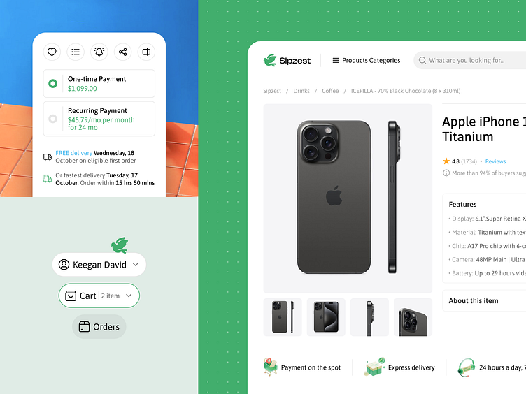
Online Store Micro Interactions
Hasn't it always been a pain in the neck to open a new window just to see your payment details?
We’ve solved that with our super user-friendly button design for Sipzest. It keeps things simple, providing concise information to put you in control.
In this shot, take a closer look at how we design a shopping platform UI, transforming the user experience from "meh" to "slay"! Everything is accessible on a single page, with dropdown buttons that allow users to review their cart or account info.
Stay intuitive with Abron’s design solutions. Drop us a
message at hi@abron.co.
More by Abron Studio View profile
Like
