McGinty Consulting - Branding Design
About
McGinty Consulting provides strategic insights and actionable solutions for businesses aiming for growth and stability. The firm prides itself on understanding market dynamics and fostering long-term client success. By focusing on innovative thinking and a client-centric approach, McGinty helps organizations navigate challenges and achieve their potential.
Design Process
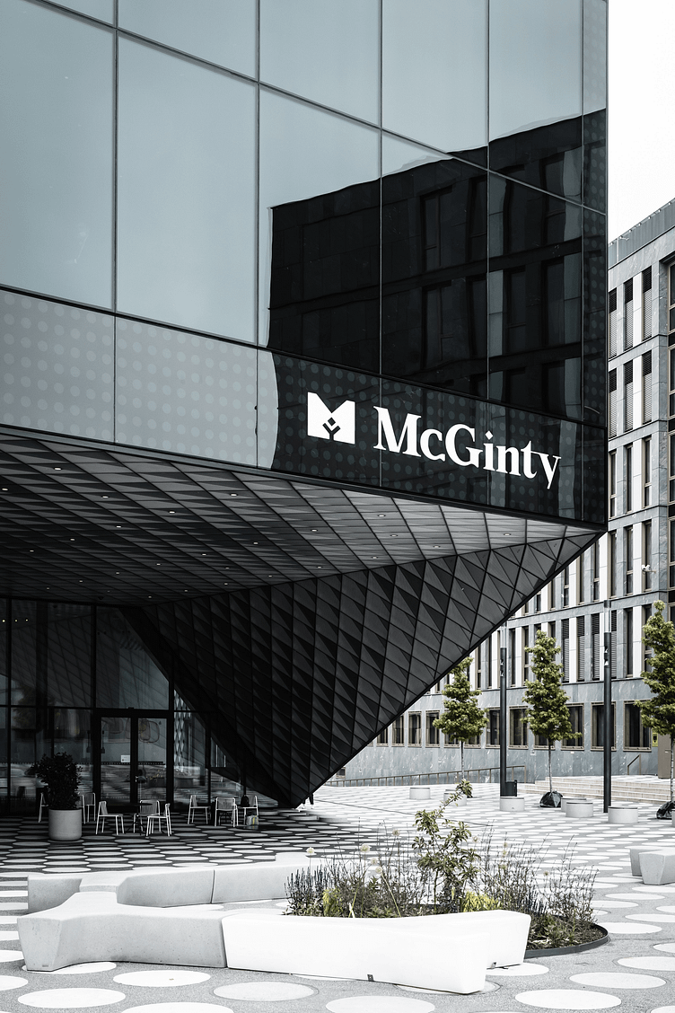
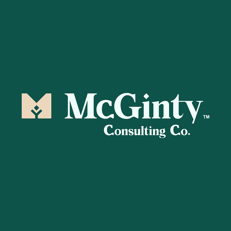
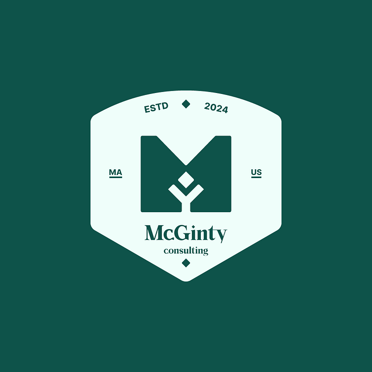
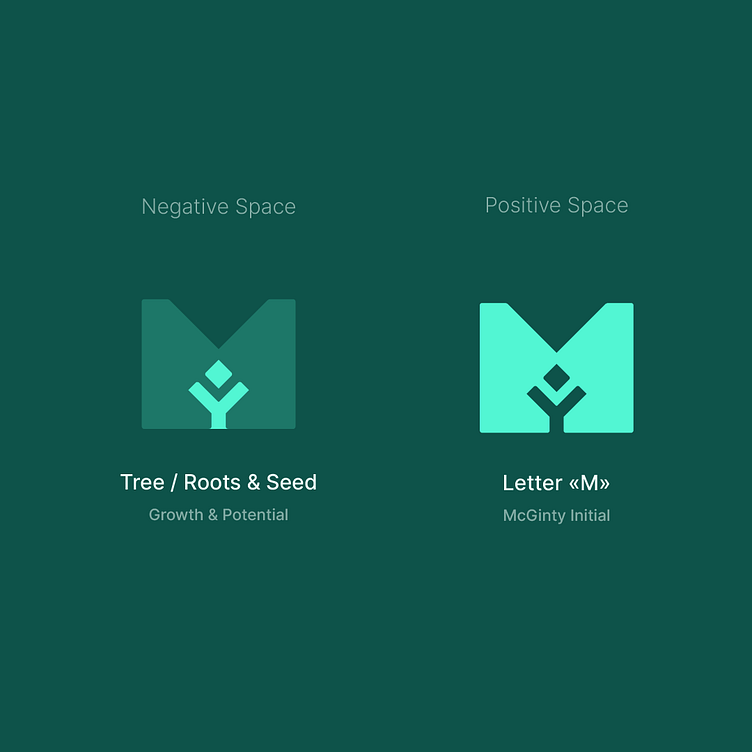
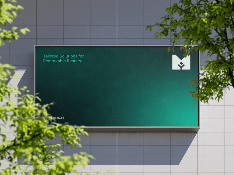
When designing the logo for McGinty Consulting, my aim was to capture the essence of growth and professionalism in a memorable mark. I began the process by understanding the client’s desire to convey reliability and a forward-thinking approach. Using the letter "M" as a base, I designed the logomark to integrate roots and growth symbolism. I employed negative space to depict a tree or seedling, representing growth and potential, aligning with McGinty’s mission.

Color Choice
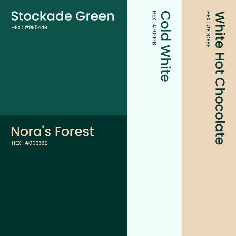
The color palette for the McGinty Consulting logo features a deep green, symbolizing growth, stability, and trust. Green is associated with nature and renewal, reflecting the firm’s commitment to nurturing client growth. The light mint background provides a soft contrast, highlighting the logomark and typography while maintaining a modern feel. This ensures the logo stands out in various mediums, reinforcing the brand's values.
Typography
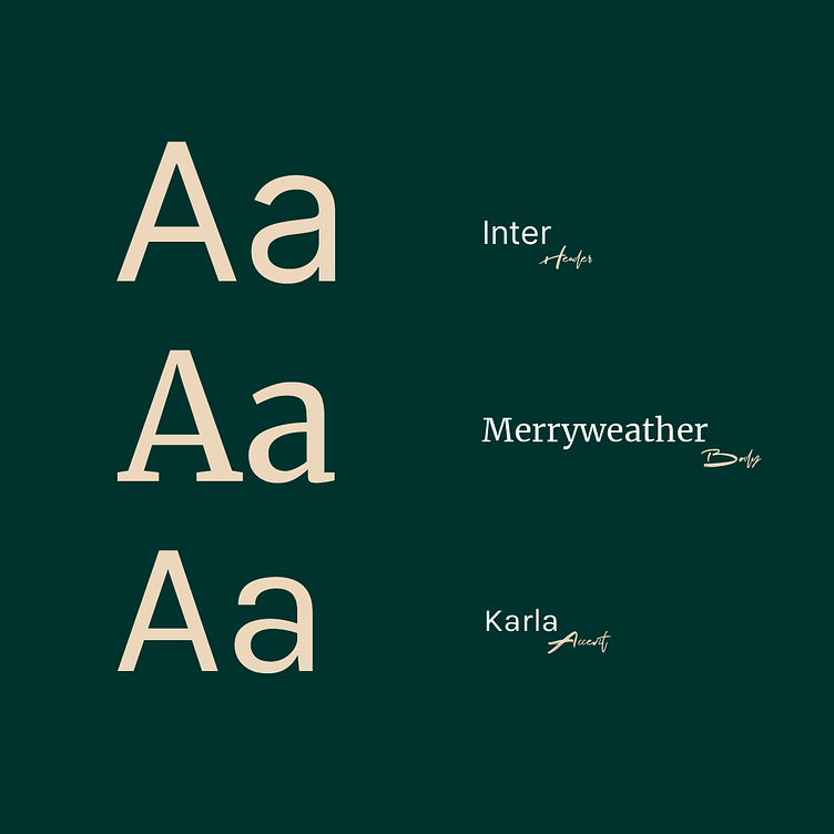
The typography for McGinty Consulting uses a custom serif font to convey an established and trustworthy image. Serif fonts are chosen for their classic and refined appearance, emphasizing the company’s expertise and reliability. The custom design ensures uniqueness and helps McGinty stand out among competitors. The addition of "consulting" in a complementary serif font ties the composition together, clearly identifying the firm's area of expertise.