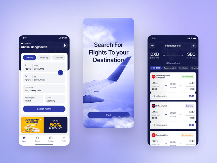
Flight Booking Mobile App Design
Overview:
This design showcases a sleek and modern flight booking mobile app, aimed at providing users with a seamless experience in searching and booking flights. The app’s design focuses on user-friendly navigation, clear and intuitive interface elements, and a visually appealing aesthetic.
This UI screen provides a comprehensive overview of flight details for a user booking or reviewing a trip from Dubai (DXB) to Seoul (SEO), with a subsequent leg to Tokyo (HND).
Design Highlights:
🔵 Color Scheme: Dominant use of blues and purples, providing a calming and trustworthy feel.
🔵 Typography: Clean and modern, ensuring readability across all screens.
Icons and Buttons: Intuitive and clearly labeled, facilitating easy navigation.
🔵 Visual Hierarchy: Effective use of spacing and size to highlight important information such as flight details and prices.
🔵 User Experience: Focus on simplicity and efficiency, allowing users to quickly find and book flights with minimal effort.
Potential User Flow:
🔵 Starting the Search: Users input their travel details and initiate the search on the Search Flights screen.
🔵 Filtering Results: Users adjust filters for departure and arrival times to narrow down options.
🔵 Viewing Flight Details: Users can view detailed flight itineraries and select the most suitable option.
🔵 Managing E-Tickets: Once booked, users can view and download their e-tickets for seamless travel.


