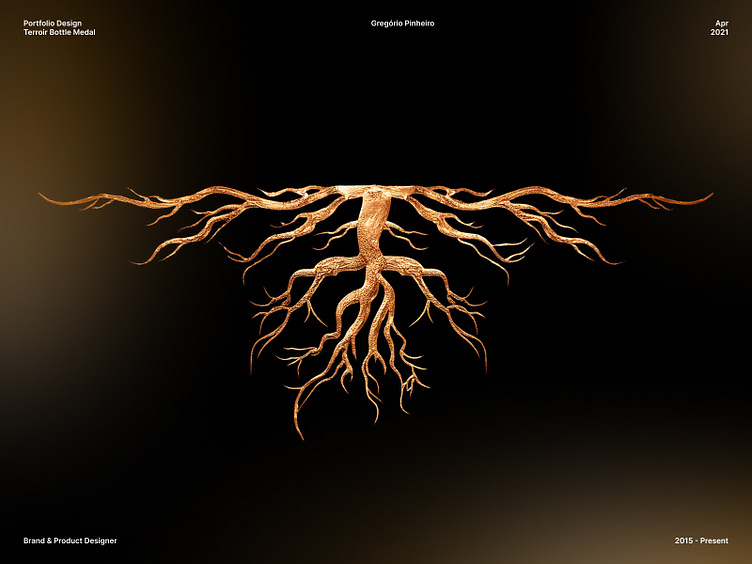
New Navy Gin Medal Design: Terroir Packaging Design
The medal features an elaborate root system, symbolizing the connection to the earth and the unique characteristics of the terroir. This artistic piece highlights the premium quality and sophisticated branding of the New Navy Gin Terroir series.
"Terroir" is a French term that describes the unique characteristics conferred to an agricultural product by the environment in which it is grown. These factors include the soil, climate, topography, and agricultural practices of the region. The concept is often applied to wines, influencing flavor, aroma, and quality, and can be extended to other products like coffee, tea, and cocoa. Essentially, terroir is the expression of the origin in a product.
To capture the essence of New Navy, the packaging design was inspired by the concept of terroir. Visual elements reflecting topography and deep roots were incorporated, highlighting the complexity and authenticity of this exceptional gin. The topographic lines on the packaging evoke soil layers and nuances of the terroir, while the roots symbolize the connection to the land, resulting in a design that is both visually impactful and representative of New Navy's unique qualities.
My Services ✍️
— Branding
— Product Design
— UX/UI Design
— Responsive Design
— Design System
— Prototyping
— Animation
— Website design
Lets work together 🎾
Feel free to reach out and contact me gregmatuzalem@hotmail.com o tell me about your project.
If you like any of my work please follow me on Dribbble.


