Sacred Owl Healers - Logo Redesign
What is Sacred Owl Healers?
Valery, the mystic soul behind the crystals is keen on unlocking the transformative power of improving one’s well-being. Navigating the online landscape can be difficult due to the prevalence of misleading claims and a dearth of unreliable information. She strives to make it easier for people to make informed decisions and implement effective solutions for their well-being. Sacred Owl Healers is a testament to the resilience, growth, and belief that life's challenges are opportunities for a purposeful life.


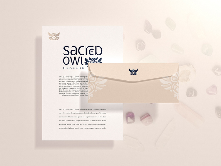
These colors are very light and airy and help to give off a peaceful ambience. It allows the beauty of her crystals to shine. Including a touch of contrast with a slightly darker neutral color helps to ground the palette and make the lighter colors appear even brighter.
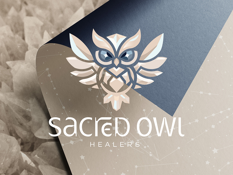
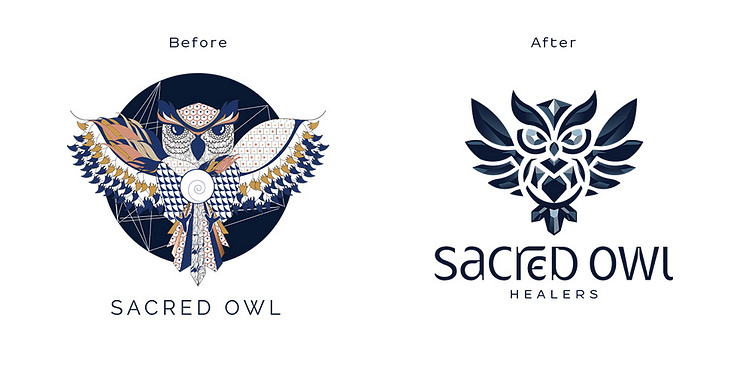
The owl embodies the essence of wisdom and the seeing eye in the darkness. It resonated with the profound journey of enlightenment, a path where one delves within to find the wellspring of knowledge. This inner wisdom that is believed to unlock the third eye, grants a deeper perception of the world. The owl isn't merely perched – it is poised to take flight, alighting upon the very person prepared to receive this sacred wisdom.
Incorporating some crystal-like elements into the design would further emphasize the connection to crystal products and add a touch of elegance.
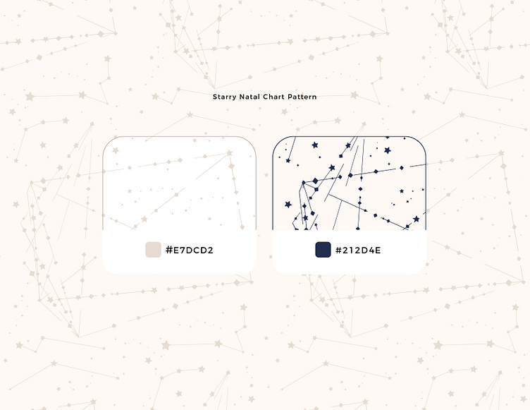
The sacred geometry in the background represents Valery’s natal birth chart. This dives into the realm of astrology, where hidden symbolism unfolds, a way for her to connect with those who are "awake" or "enlightened" – those who can decipher the symbolic language surrounding them.