Website Design Concept / ADVANCED COPY
Finally new design concept 🥹
I absolutely didn’t like my first attempt at design for this website (terrible composition, content balance and contrast), therefore I’m back to you with a new one 🏃♂️➡️
For a better understanding of the design, I decided to animate the layouts 📹
You can read about all explorations I did below👇
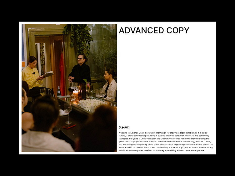


First Screen
The first design concept in this case turned out to be final 😅
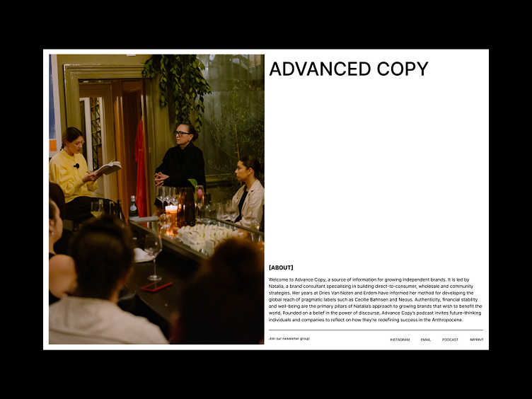
In the second version I added a links 🔗, but I didn't really like that idea 🫠. I wanted the first screen to be as minimalistic and clean as possible.
One screen — one idea (in this case, getting to know the website and its purpose).
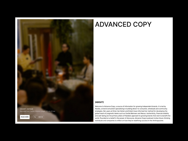
After I decided on the overall composition, I moved on to interactivity🕺. So I tried different image hover concepts. I liked the image blur and centered content 🙌. In this case, the composition is maximally balanced and strict
All Projects
Main goal of this screen is to present all projects as conveniently as possible 🤓
I also wanted to make focus on the button that opens the library with all projects. Therefore, when creating concepts, I started with the placement of the button ▶️
Tried a lot of different layouts and grids and settled on a classic arrangement layout (only resizing the images for contrast)
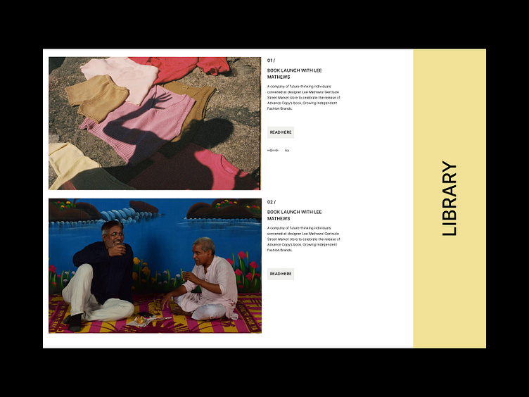
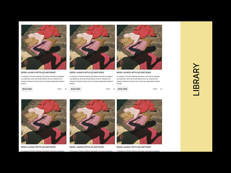
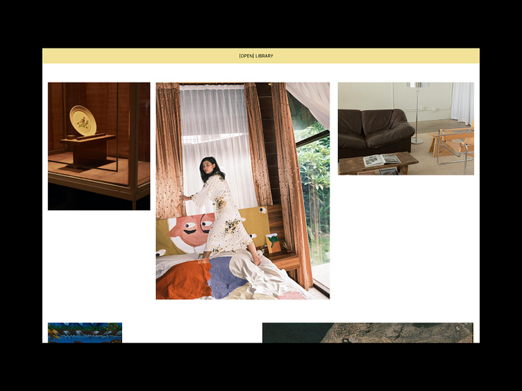
The first design concept for the library screen 📚was as similar as possible to what is on the existing site (I really like this version of the site itself😍, I didn't want to change much, but I wanted to create a completely new and fresh design)

I liked the idea of placing the category filter on the left, and placing the library content on the right.
But there was one significant minus — the maximum number of projects should fit in one screen (and not two projects, as in the concept 💀), so that the user does not have to constantly scroll.
*and I also liked the idea with the button🙃
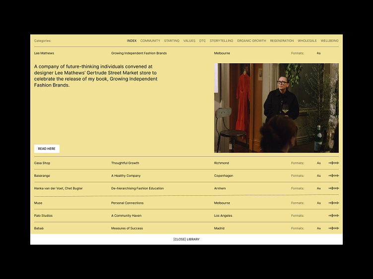
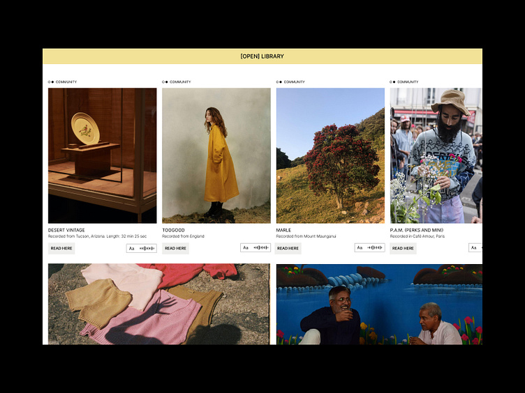
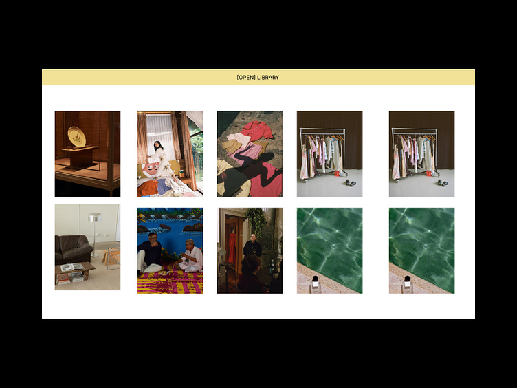
In this concert, I developed the idea with the buttons — highlight them in white 🌚
Also reorganized all the content, in order to display the maximum number of projects 😌
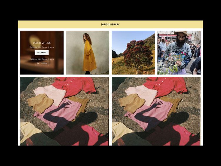
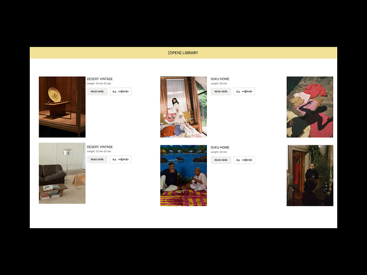
I realized that the idea with the button is superfluous here, because users already move the cursor to the name of the project and click there
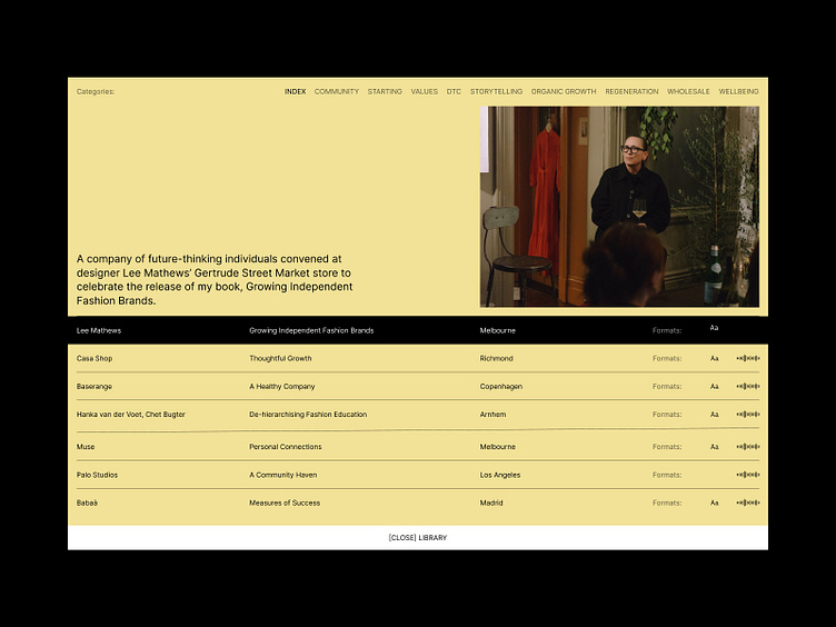
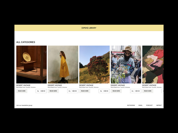
So I returned to the first concept and added some contrast (also kept some ideas from past concepts🕣). Added a hover effect that makes it easier for users to understand how to interact with elements ⚙️
