KFC Homepage Redesign
KFC Homepage Redesign
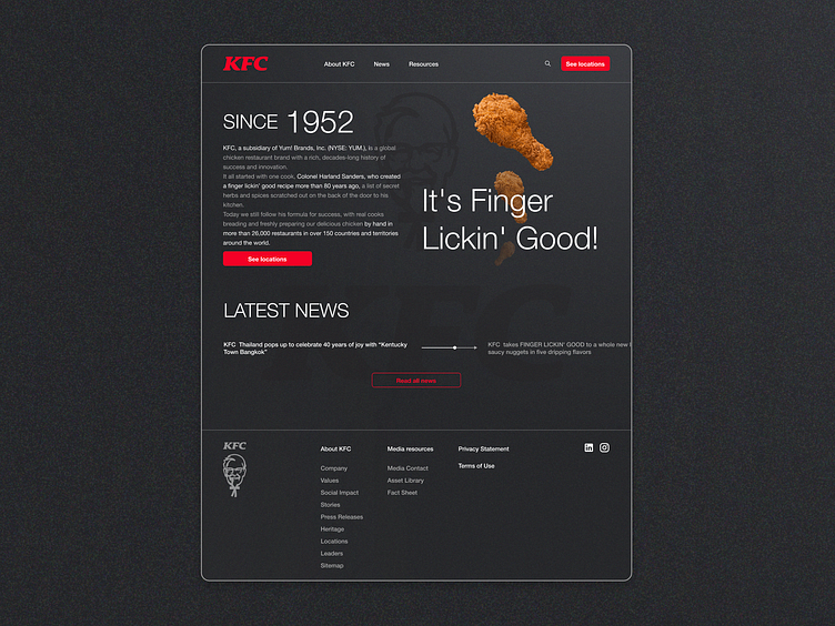
🍗✨ Experience KFC like never before with a sleek, modern redesign.
Design Features:
Dark Colors: Bold and sophisticated palette for a striking visual impact.
Grainy Gradient: Adds texture and depth to the background.
Minimalism: Clean, uncluttered layout that focuses on what matters.
💬 Feedback Welcome! Let me know your thoughts!
More by Alexandra Agapova View profile
Like
