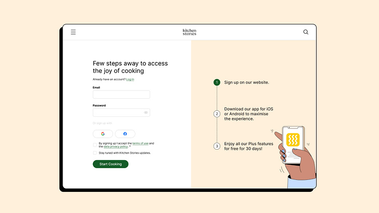
Daily UI: Kitchen Stories Sign up page re-design
Recently I started Daily UI challenge to put my design and UX knowledge into practice.
As a big fan of Kitchen Story- a digital recipe application, I re-designed their sign up page from analyse the existing design to roll out two different versions for A/B testing.
Observation
I designed two versions for the AB test. One is closer to the original, where users can clearly see each step. The other is a cleaner version where users can focus on the context with a better flow.
Title could be more appealing with customised copy
Simplify and clean up the hierarchy
Optimise the focus flow
Highlight and add more detail to guide the user to take the action to download the app.
Design
I have designed two versions for AB test. One is closer to the original one where the users can clear see each steps clearly. The other one is an cleaner version where the users can focus on the context with a better flow.
Final Thought
Personally, I prefer option A, not only because it has a much clearer hierarchy, but also because it gives a bit more of a human touch to the experiences. If I have more than one day, I would like to add some motion design. Thank you for reading about my little design practice. I would love to hear your thoughts.
*Please note: all assets are from the Kitchen Stories website and are for study/practice purposes only.


