Transforming AI with Style: The New desh.AI Website Redesign 💡✨
Fantastic Visual Appeal ✨
The redesigned of desh.AI website boasts a fantastic visual appeal. With its unique alignment and structure, the design not only captures attention but also provides a seamless and engaging user experience. The combination of colors and typography adds to its stunning aesthetics, making it both functional and beautiful.
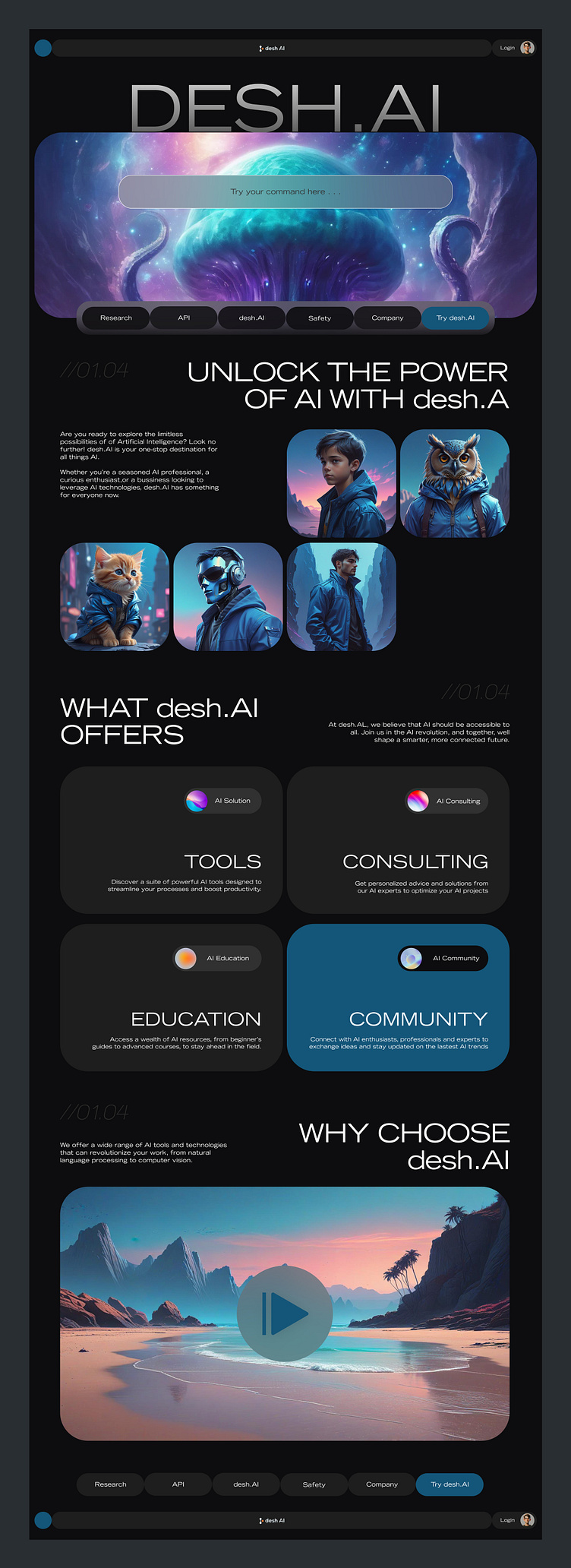
Uniquely Structured & Aligned 🧩🔍
I ensured the redesigned desh.AI website features a unique structure and alignment. This distinct layout makes the site intuitive and visually appealing, enhancing user experience.
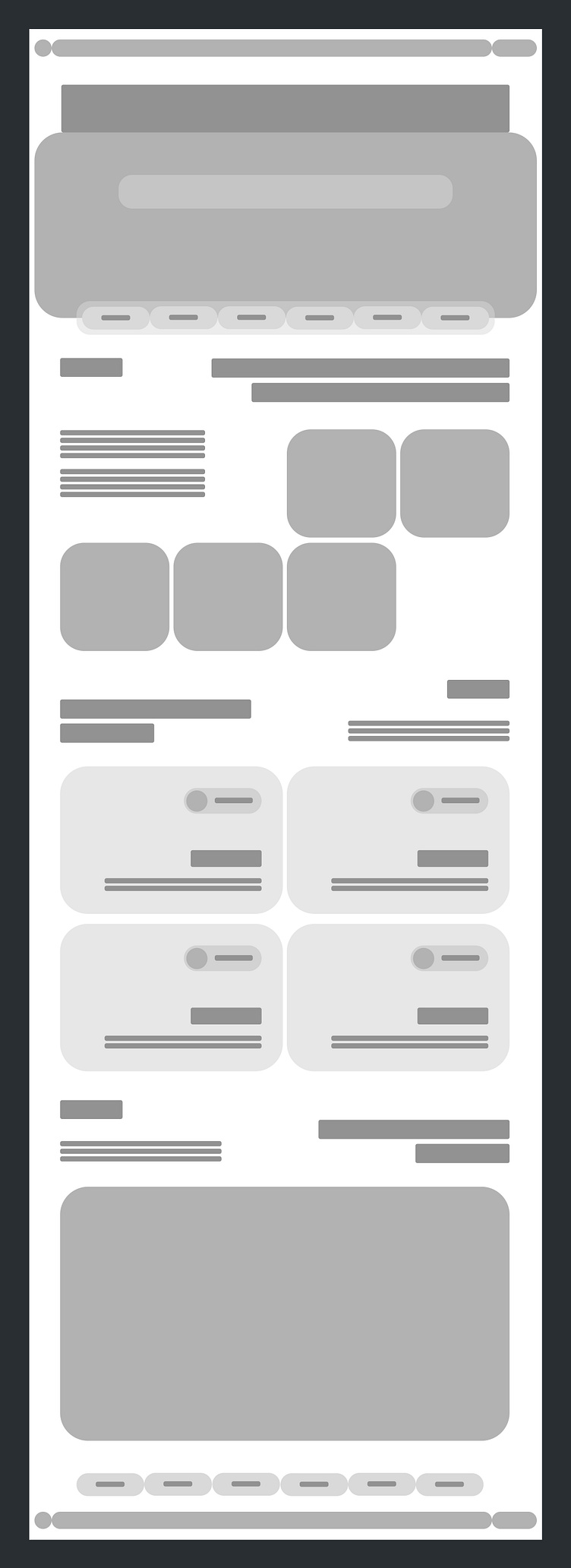
High-Fidelity Wireframe Magic 🪄📐
To ensure precision and clarity, I created a high-fidelity wireframe for the desh.AI website redesign. This wireframe serves as a detailed blueprint, helping me visualize the final design and make informed adjustments.
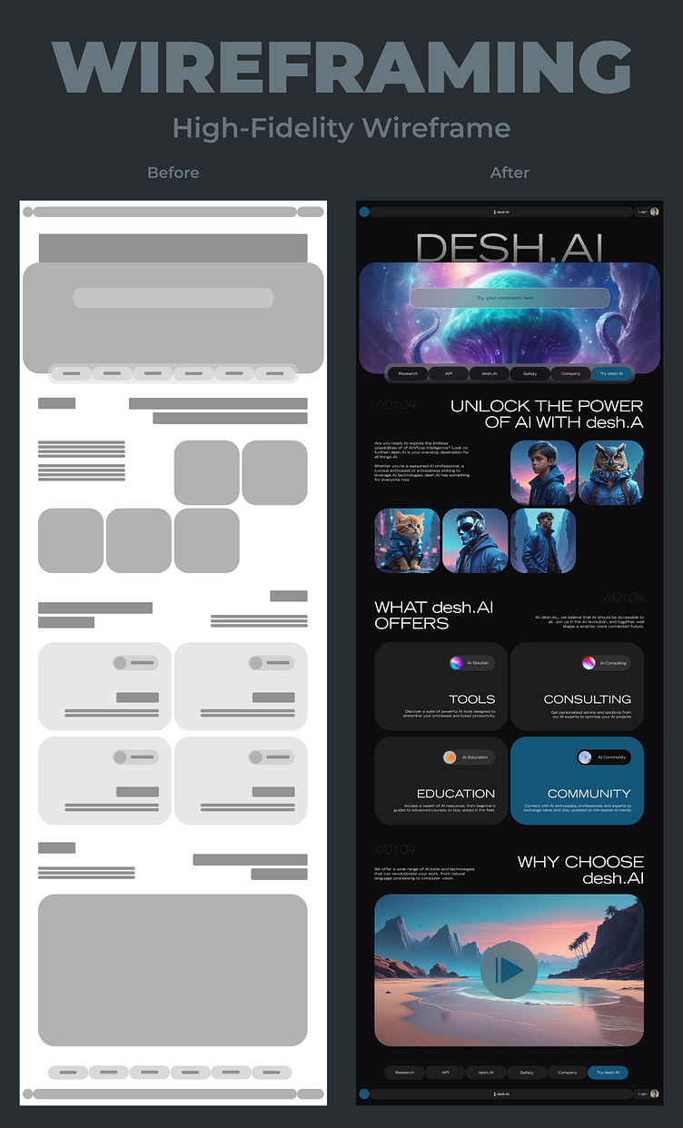
Design Comparison Mastery 🎨🔍
I meticulously compared the high-fidelity wireframe with the actual design. This comparison helped me identify and refine any discrepancies, ensuring the final product aligns perfectly with my initial vision.
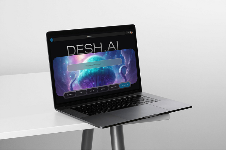
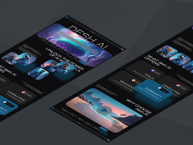
Sleek MacBook Mockup Showcase 💻✨
To showcase the redesigned desh.AI website, I created a MacBook mockup. This mockup provides a realistic preview of how the website will look and function on a popular device, offering a tangible sense of the user experience.
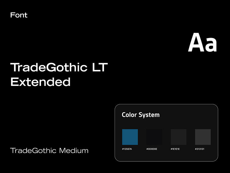
Elegant Colors & Typography 🎨🖋️
For this redesign, I chose a sophisticated color palette featuring Chathams Blue, Dark Jungle Green, Woodsmoke, and Dune. These colors, combined with the TradeGothic LT Extended font, give the website a modern and professional appearance, perfectly aligning with desh.AI's brand identity.
