Efundrs - UI UX Branding
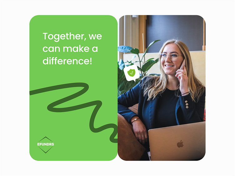
Building Trust and Community!
Welcome to EFUNDRS! We are excited to share the story behind our branding, which reflects our mission to strengthen community bonds.
ABOUT PROJECT
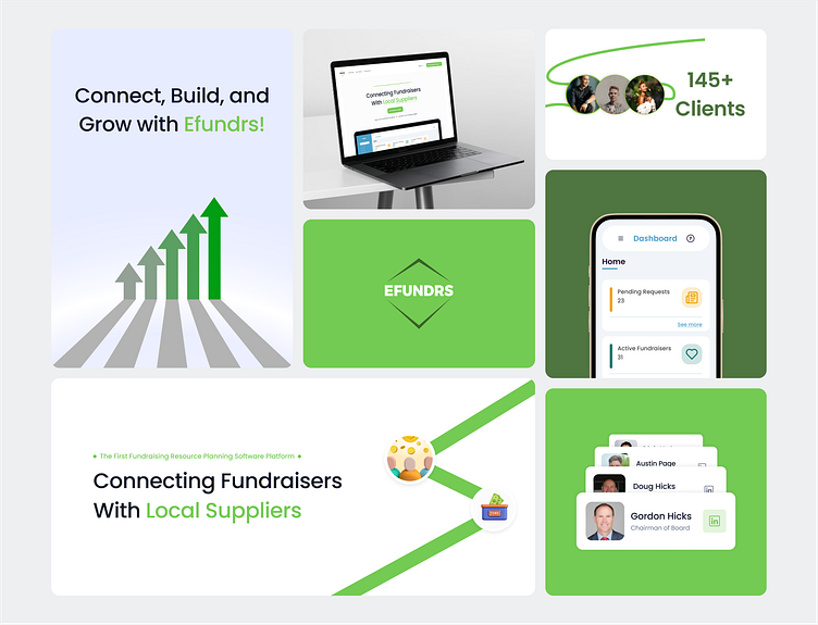
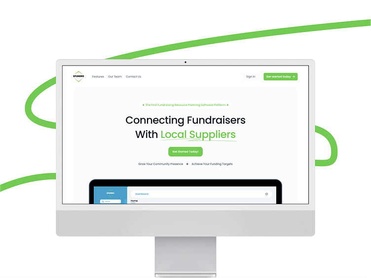
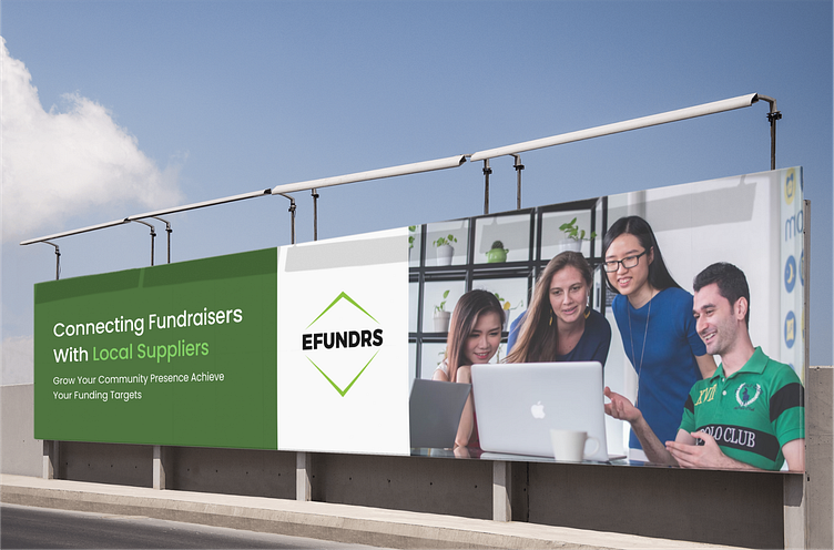
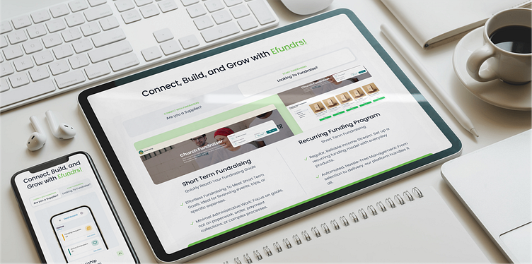
We created EFUNDRS to make fundraising seamless and effective, connecting fundraisers with local businesses. Our innovative tools and dedicated support empower both parties to contribute to their community’s success.
ABOUT COLORS
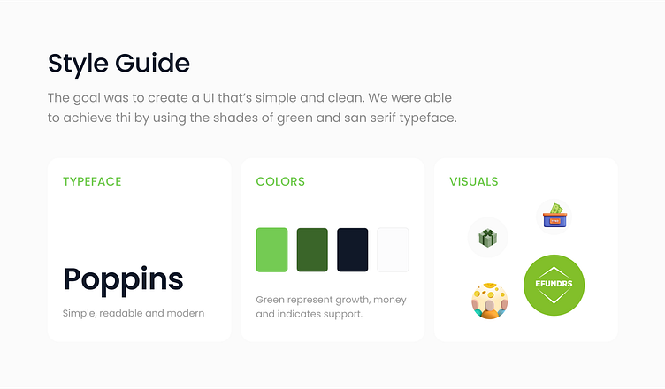
Vibrant green represents growth, renewal, and prosperity. It reflects our commitment to helping communities thrive. deeper, earthy green conveys stability, reliability, and a strong foundation, mirroring our dedication to building lasting connections.
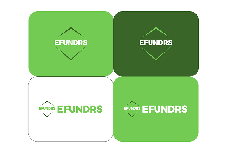
Our logo resembles a shield, symbolizing protection and trust. We chose this shape because we aim to be a reliable support for fundraisers and local businesses. The name "EFUNDRS" written underneath signifies our focus on fundraising and community growth.

We created EFUNDRS to make fundraising seamless and effective, connecting fundraisers with local businesses. Our innovative tools and dedicated support empower both parties to contribute to their community’s success.
