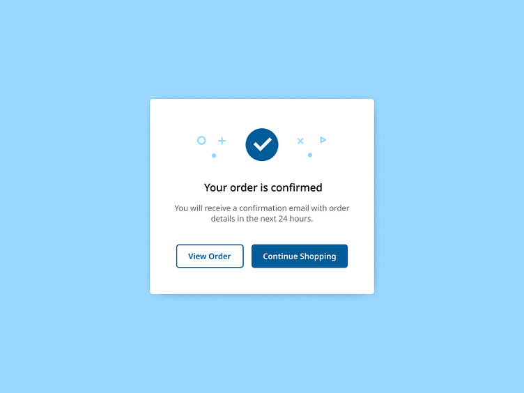
Daily UI Challenge #5 - Pop out Window
To enhance my UI skills, I've embarked on a journey to design small components daily. Inspired by Michał Malewicz's "Daily UI Challenge" from Hype4Academy, this project marks another step in my quest for continuous improvement.
Project Overview:
For this project, I've focused on designing a pop-up window. Pop-up windows are crucial for various applications, providing users with important information or prompting actions without navigating away from the current page. I drew inspiration from various online designs and incorporated feedback from other designers on Hype4Academy to create a polished final result.
Pop-Up Window Description:
My pop-up window is designed to offer a seamless and engaging user experience.
Key features include:
Clear and Concise Messaging:
The main message is prominently displayed, ensuring users understand the purpose of the pop-up immediately.
Actionable Buttons:
Two distinct buttons for users to take action, such as "Confirm" and "Cancel," are clearly visible and easy to interact with.
Visual Hierarchy:
The design employs a clear visual hierarchy, guiding users' attention to the most important elements first.
Aesthetic Appeal:
A modern and clean design that aligns with the overall aesthetic of the application, enhancing user experience without being intrusive.
