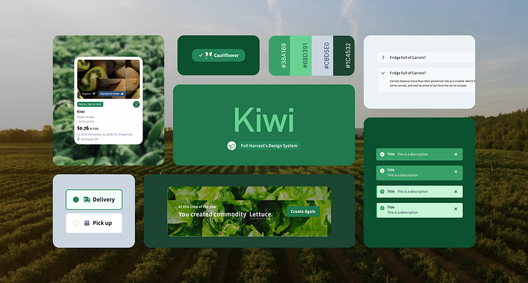
Full Harvest Design System
I led the creation of a design system that would fit within the new framework I brought to the development process. I hired and led a team to build a foundation that not only respects the brand but is also primed for future growth.
Project Summary
Our team's goal was to create a design system that would fit within the new CSS framework. We built a foundation that not only respected the brand but also primed for future growth.
The Principles
Accessible: We align with WCAG standards to ensure inclusivity. Key features include adaptable color contrasts, readable typography, and comprehensive ARIA labels, enabling users of all abilities to navigate with ease.
Atomic: Our system breaks down UI elements into atoms, molecules, and organisms for modularity and consistency. This simplifies interface development, promoting reuse and coherence across projects.
Soft 8-pt grid: The soft 8-point grid underpins our layout design, providing a scalable structure that ensures visual balance and alignment across different devices and screen sizes, enhancing both aesthetics and functionality.
Extensive: Featuring a broad range of components, our design system is documented, offering guidelines for UI elements, color schemes, and typography. This ensures brand alignment and a cohesive user experience.
Flexible: Designed for adaptability, our system allows easy customization of elements to meet diverse project needs. This flexibility supports brand evolution and accommodates various design requirements.
Cross-functional: Our system is structured to serve different teams and applications, from marketing to product development. It provides specialized components for each use case, fostering collaboration and consistency.
Results
Having Kiwi allowed the product team to work on over 30 features in the span of a year.
The Design System, with its arsenal of over 200 components, significantly accelerated our workflow, enabling the team to focus on intricate flows and strategic developments across multiple versions without the need to redesign elements repeatedly. This comprehensive approach also minimized inconsistencies and errors between elements across the platform, ensuring a more unified and efficient design process.


