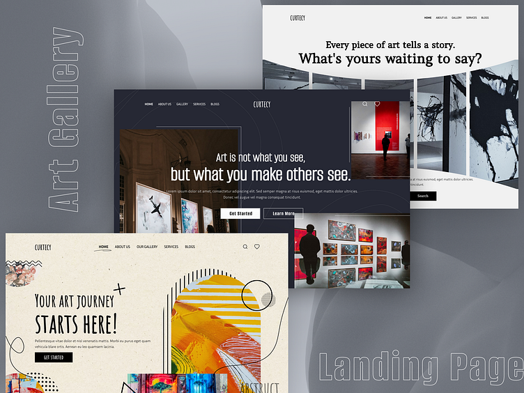
Minimal Art Gallery Website Homepages UI UX Design
Minimal Modern Elegance: Art Gallery Homepages
This UI/UX project focuses on crafting a minimalist and modern homepage for an art gallery website. The design prioritizes elegance and user experience, allowing the artwork to take center stage.
Key Features:
Clean Layout: A spacious layout with ample white space ensures a clutter-free browsing experience.
Hero Image/Video: A large, high-quality image or video showcases a featured artwork or upcoming exhibition.
Curated Navigation: A minimalist navigation bar provides clear access to essential sections like "Artists," "Exhibitions," and "About Us."
Interactive Artwork Grid: A clean and interactive grid layout allows users to explore featured artworks or browse by artist or collection.
Subtle Animations: Subtle hover effects and transitions add a touch of dynamism without overwhelming the user.
Compelling CTAs: Strategic calls to action encourage visitors to learn more about artists, and upcoming events, or contact the gallery.


