21/32 – Minnesota Chippers
Keep Building
We jumping back over to the West Conference to share the the first team of the Northern Division – the Minnesota Chippers.
The Chippers franchise is a true ground-and-pound team with a tenacious defense. In the late teen seasons, they experienced a run of three straight championship game appearances – something only ever done by the Lonestars, Dragons, and Aztecs. These runs all came with heart-breaking losses, however. (three-fourths of a Buffalo Bill, if you will). Since this run, the Chippers have been very middle-of-the-pack and have missed the playoffs for 6 straight campaigns.


Visual Direction
This franchise leans in to the history of the logging industries in Minnesota and its undeniable tie to folklore in the region (the first Paul Bunyan statue is located in Bemidji, MN). In the late 19th century, Minnesota experienced a great logging boom with lumberjacks clearing the sites and sawmills popping up along the rivers to cut the lumber to length and distribute to builders.
Visually speaking, this identity takes shape around nature's ecosystem engineer, the beaver, but the team name "Chipper" is a double entendre of sorts. It's also a play on "Minnesota nice" and the upbeat or mild-mannered nature often associated with its residents.
Execution
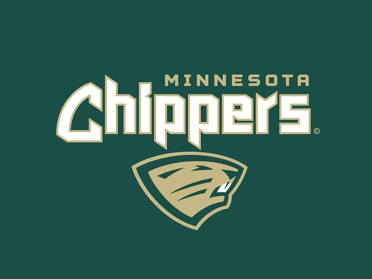
The primary logo for Minnesota is a beaver in a slight 3/4 perspective – just enough to display its teeth and angled in a way that produces a practical silhouette. The symmetrical construction and the tapering on the neck allows for ease of placement on the modern football helmet.
The secondary mark for the Chippers is an "M" carved from a pine trunk slice. This graphic is a nod to the logging industry that surrounds Minnesota and the northern U.S.
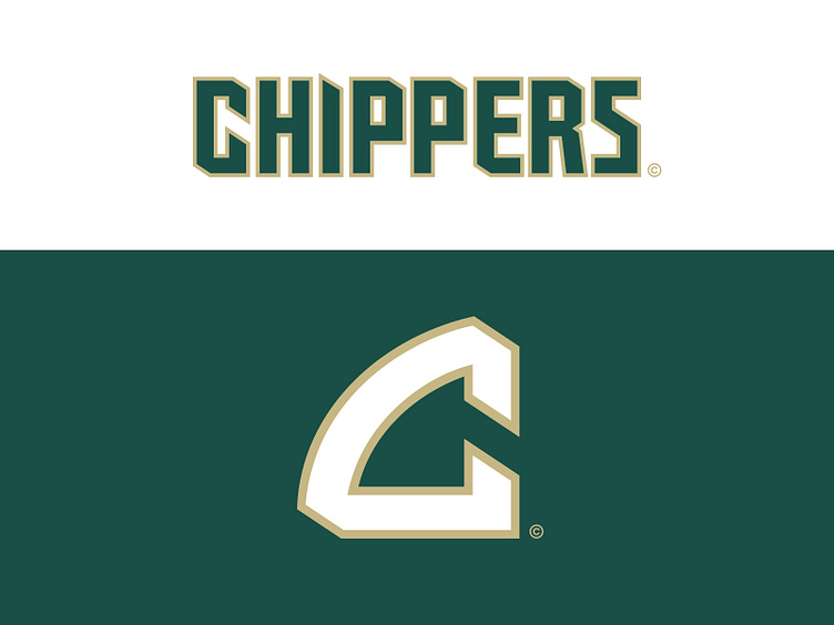
In the tertiary spot is a "C" that has been extracted from the team wordmark and used as a short-hand team identifier. It abstractly illustrates the gnawing teeth of a beaver.
The Chippers have two separate wordmark designations for the team typography. The first primary wordmark is "Chippers" in a mixed-case format with "Minnesota" nested above it. The letterforms are chipped and chopped and rather craggy in appearance to help illustrate the woodchopping inspiration of the identity. Letters like the "i" and "r" represent this idea the best, looking like a notch cut and a tree branch respectively. The capital "C", as previously mentioned, portrays the teeth of a beaver. The second wordmark designation is an all-caps version of the primary, with both location and team name versions in the arsenal.
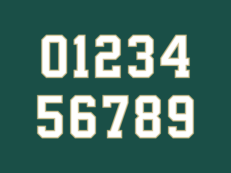
The jersey number set is a classic athletic block that is shared by a few other UFL teams. The choice for a standard number font as opposed to a custom bells-and-whistles re-emphasizes the hardworking culture behind the Chippers.
Dam Tough
This tough-as-nails Minnesota Chippers franchise has a reinforced brand identity with a deep graphic suite that pays homage to the region it represents.
Football Helmet Mockup by SportsTemplates
____________________