Food website Home Page
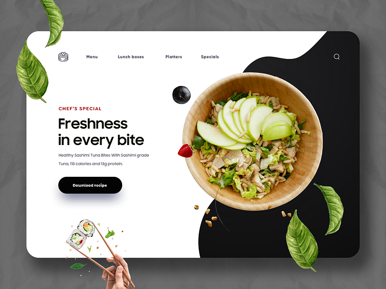
This is a web design concept for a culinary website that highlights a "Chef's Special" dish. The design features a modern and clean interface with a focus on high-quality visuals and clear typography. The background consists of a light, textured surface with a contrasting black and white split, creating a visually appealing layout.
At the top of the page, the navigation bar includes links to different sections such as "Menu," "Lunch Boxes," "Platters," and "Specials," along with a small icon representing a stack of pancakes and a search icon.
The main content area is divided into two sections. On the left, the text block prominently displays the dish's highlight: "Freshness in every bite," followed by a description of the dish: "Healthy Sashimi Tuna Bites with Sashimi-grade Tuna, 110 calories, and 13g protein." A call-to-action button labeled "Download recipe" is placed below the text, inviting users to get the recipe.
On the right side, there is a large, circular image of a delicious bowl of sashimi tuna bites, garnished with fresh green apple slices and greens. Scattered around the bowl are various food elements like basil leaves and a berry, adding a dynamic and fresh feel to the design.
The bottom of the page features a hand holding chopsticks with sushi pieces, adding a playful and interactive element to the design. This web design concept effectively combines aesthetic appeal with functional elements, creating an engaging and appetizing experience for visitors.
