Rad Mockups Practice - with my own spin ✨
The original task was to re-create the mock-up verbatim, but I wanted to see how I could take this interface to the next level.
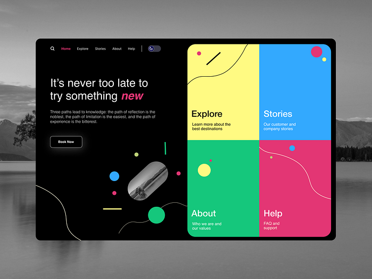
I created a dark and light mode for this interface. I played around with the colour scheme with a vibrant summer flair to see if the colours would be accessible on both modes.
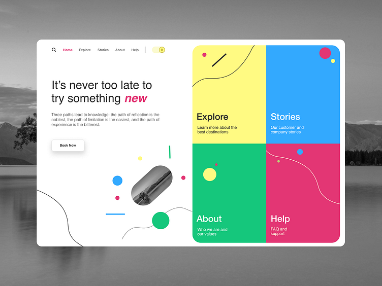
Taking Inspiration from Tubik's dribbble shot, I improved the screen by adding extra links, such as showing the user what page they are on. I added navigation of the four links up top and added a toggle for the user to choose light or dark mode.
Keeping a similar layout to Tubiks', I added more hierarchy to the headings and different shapes within the four cards. I also adjusted the buttons to have a more square button look with a diffused shadow.