[PROJECT] SAL BRAND IDENTITY
[𝐏𝐑𝐎𝐉𝐄𝐂𝐓] 𝐒𝐀𝐋 𝐁𝐑𝐀𝐍𝐃 𝐈𝐃𝐄𝐍𝐓𝐈𝐓𝐘
1. Tên logo: SAL
2. Lĩnh vực: Giải trí
3. Yêu cầu: Biểu tượng kết hợp chữ
4. Màu sắc: Đỏ
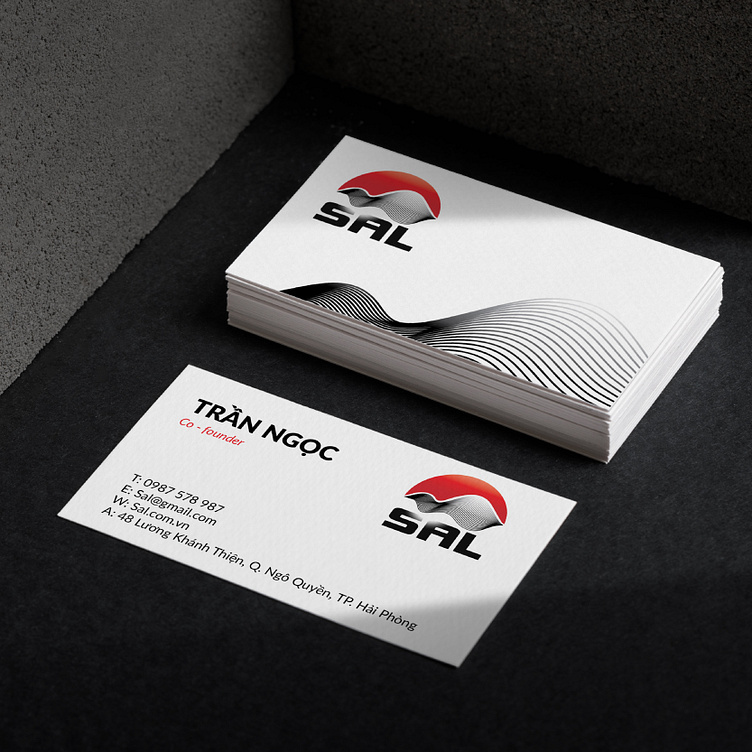
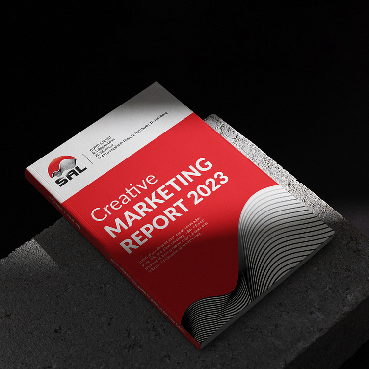
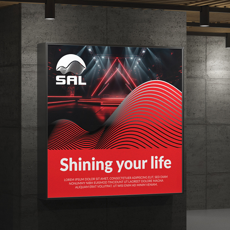
SAL là công ty giải trí phát triển về âm thanh và ánh sáng, Sibic đã lên ý tưởng thiết kế logo SAL độc đáo lấy ý tưởng từ việc kết hợp hình ảnh sóng âm và mặt trời nói lên ý nghĩa của tên thương hiệu SAL (Sound and Light). Logo sử dụng màu đỏ làm chủ đạo thể hiện được nhiệt huyết, đam mê của người làm sự kiện, kết hợp cùng font chữ thương hiệu không chân hiện đại tmảnhiện sự chuyên nghiệp. Tổng thể tạo nên một logo độc đáo, ấn tượng, vừa thể hiện được lĩnh vực kinh doanh , vừa mang lại cho khách hàng cảm nhận về sự tin tưởng, uy tín của thương hiệu.
--------------
1. Logo name: SAL
2. Field: Entertainment
3. Requirements: Symbol combined with text
4. Color: Red
SAL is an entertainment company that develops sound and light. Sibic came up with the idea of designing a unique SAL logo inspired by combining the image of sound waves and the sun to express the meaning of the SAL brand name ( Sound and Light). The logo uses red as the main color to show the enthusiasm and passion of the event organizers, combined with a modern serif font to represent professionalism. Overall, creating a unique and impressive logo that both represents the business field and gives customers a sense of trust and prestige of the brand.
----------------
SIBIC CO.,LTD
➤ Hotline: 0947 266 558
➤ Email: sibic.vn@gmail.com
➤ Website: https://www.sibic.vn/