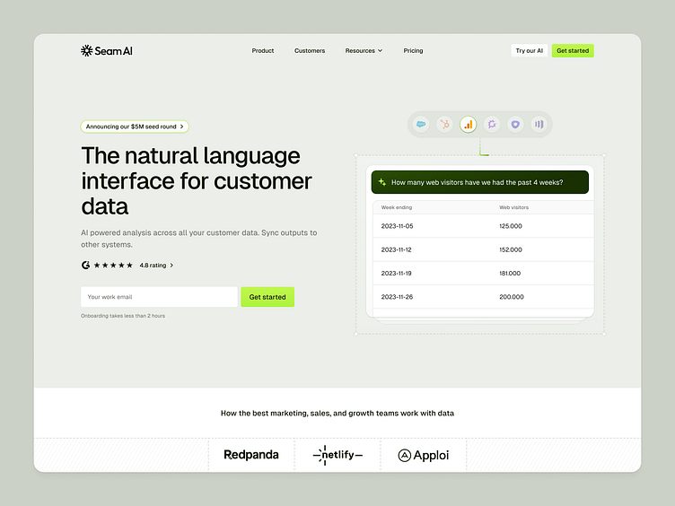
Seam - Homepage
Seam approached us to improve the early version of their MVP. Apart from product design expertise they were also looking for help with telling their story with a fresh brand. The new identity needed to speak to mature companies, who have achieved product-market fit and moved into the growth phase.
Our approach was to create a clean look & feel with a distinct accent color inspired by the “sewing” metaphor (“seam” as in stitching multiple things - data sources together). This is reflected across the website with subtle dotted lines meant to represent a running stitch.
See more:
More by Semiflat View profile
Like

