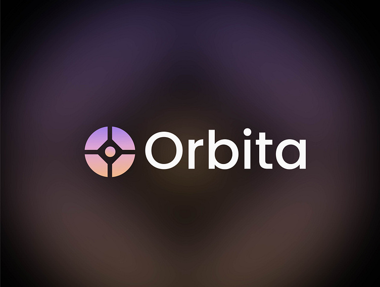
Orbita Logo Design
Orbita Logo Design
Concept: The Orbita logo embodies the essence of connectivity and balance. The central geometric design represents unity and stability, with a circular form symbolizing wholeness and continuous motion. The intersecting lines create a sense of focus and direction, making it a versatile symbol for various applications.
Design Elements:
Color Palette: The gradient from soft purple to peach reflects innovation and creativity, while maintaining a calm and inviting aesthetic.
Typography: The clean, modern typeface complements the logo's geometric precision, ensuring clarity and readability.
Symbolism: The central point signifies a focal point or nucleus, emphasizing the idea of a central hub or core.
For business inquiries: Pixelprismcreative@gmail.com

