Coreblue Dashboard Redesign: Elevating Service Consulting 🚀
Flawless Alignment & Structure 📏
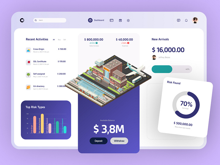
I’ve crafted the Coreblue dashboard with impeccable alignment and structure. Every element is meticulously placed to ensure a seamless and intuitive user experience.
Original link: https://coreblue.com/
Stunning Aesthetics ✨
This redesigned dashboard exudes a spectacular visual appeal. My focus was to create a design that not only looks beautiful but also enhances user engagement through its clean and professional appearance.
Detailed and Precise Planning 📋
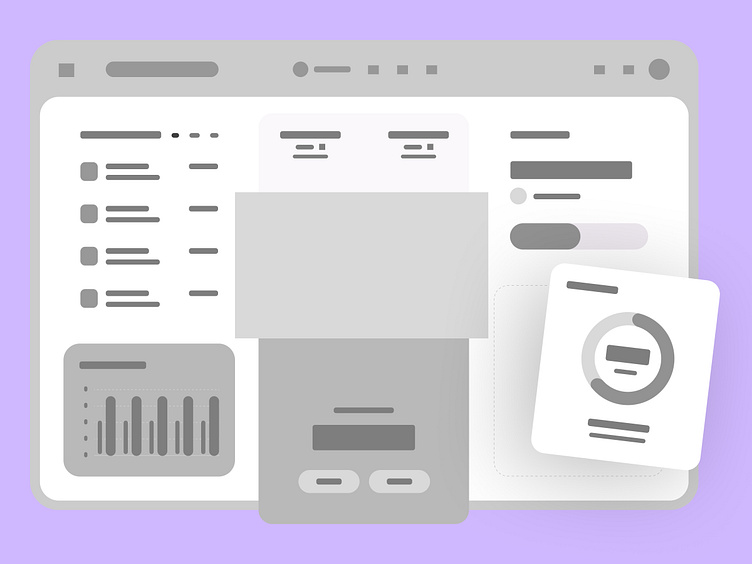
I developed a high-fidelity wireframe for the Coreblue dashboard, serving as a comprehensive blueprint for the design. This wireframe detailed every element and layout decision, providing a clear guide to ensure the final design was both functional and visually consistent with the original vision.
Detailed Comparison & Consistency Check 📐
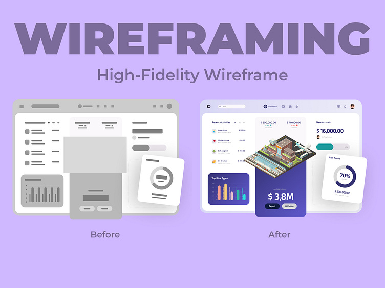
I meticulously compared the high-fidelity wireframe to the actual design, ensuring every detail matched perfectly. This step was crucial to maintain consistency and accuracy throughout the redesign process, guaranteeing that the final dashboard reflects the initial vision while enhancing functionality and visual appeal.
Versatile iPad Mockup 🖼️
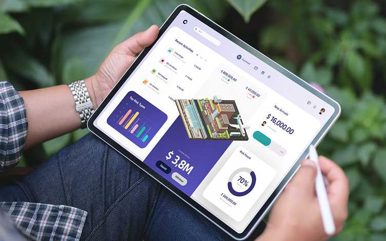
To highlight the design's adaptability, I created an iPad mockup. This mockup showcases how the dashboard functions on a tablet, demonstrating its responsive design and user-friendly interface.
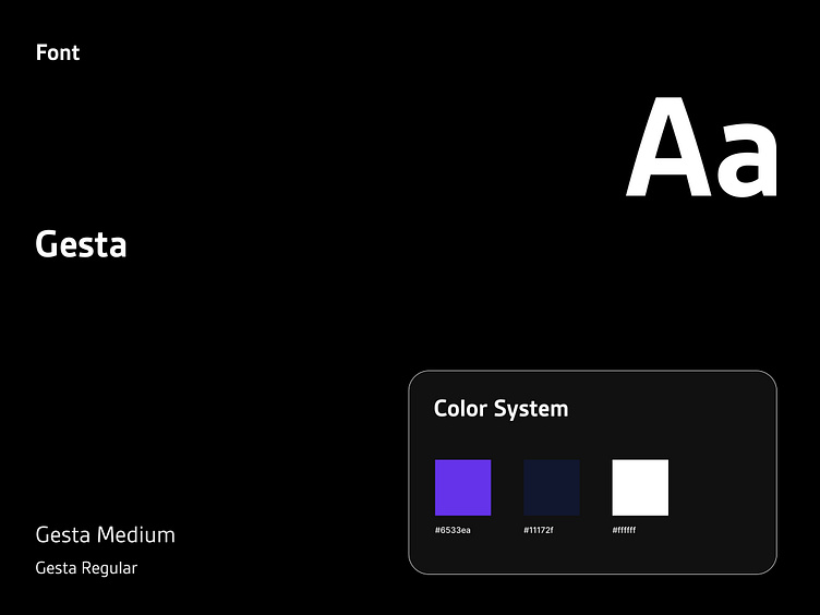
Elegant Colors & Modern Typography 🎨
I selected a refined color palette featuring Purple Blue, Mirage, and White, which together create a polished and cohesive look. The use of the Gesta font adds a modern and sophisticated touch, enhancing the overall readability and aesthetic of the design.
