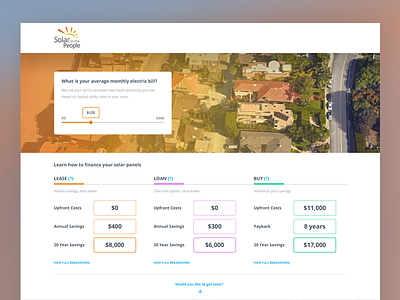
Solar - Comparison Page
Some experiments with a comparison page for a solar startup. Excludes some information architecture (navigation) as during this stage of the project, there's a strong focus on what the most optimal customer journey looks like.
This page is one of the most important pages for initiating the conversion funnel.
Full pixels attached!
More by Sven Lenaerts View profile
Like
