AN AN | LOGO DESIGN & BRAND IDENTITY
An An Trading and Tourism Co., Ltd. is committed to providing customers with great travel experiences and high-quality commercial services, creating sustainable value and maximum satisfaction.
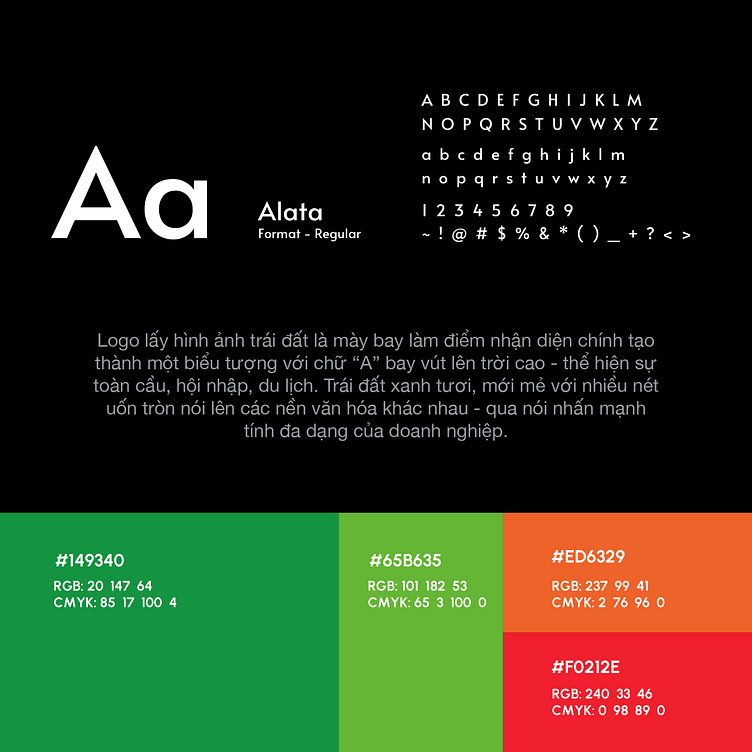
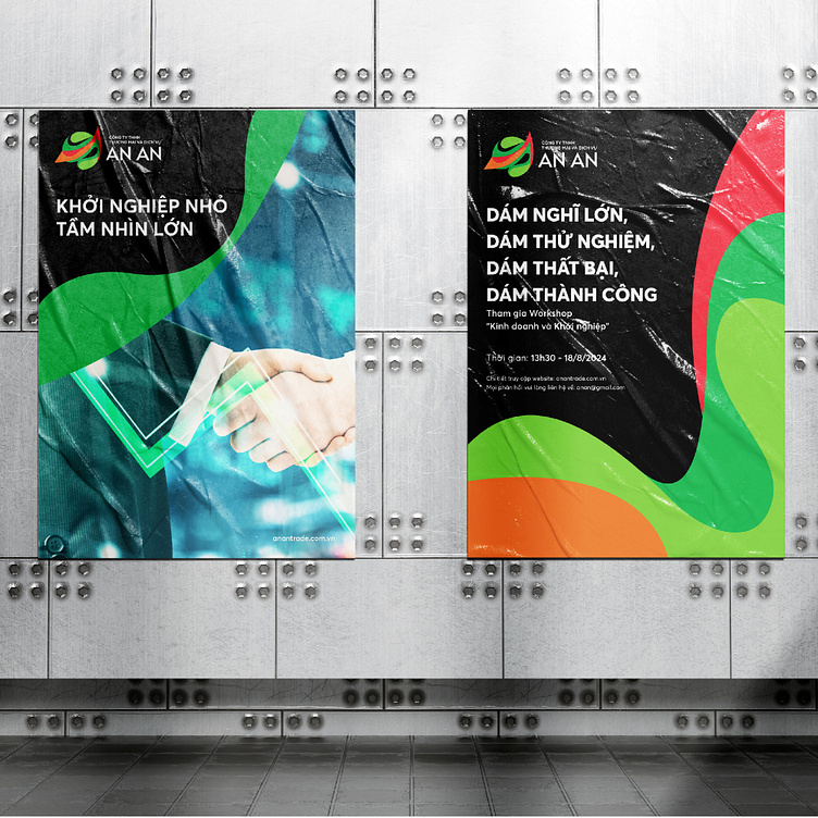
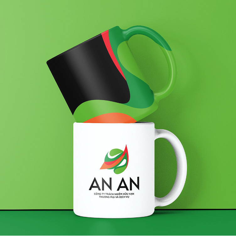
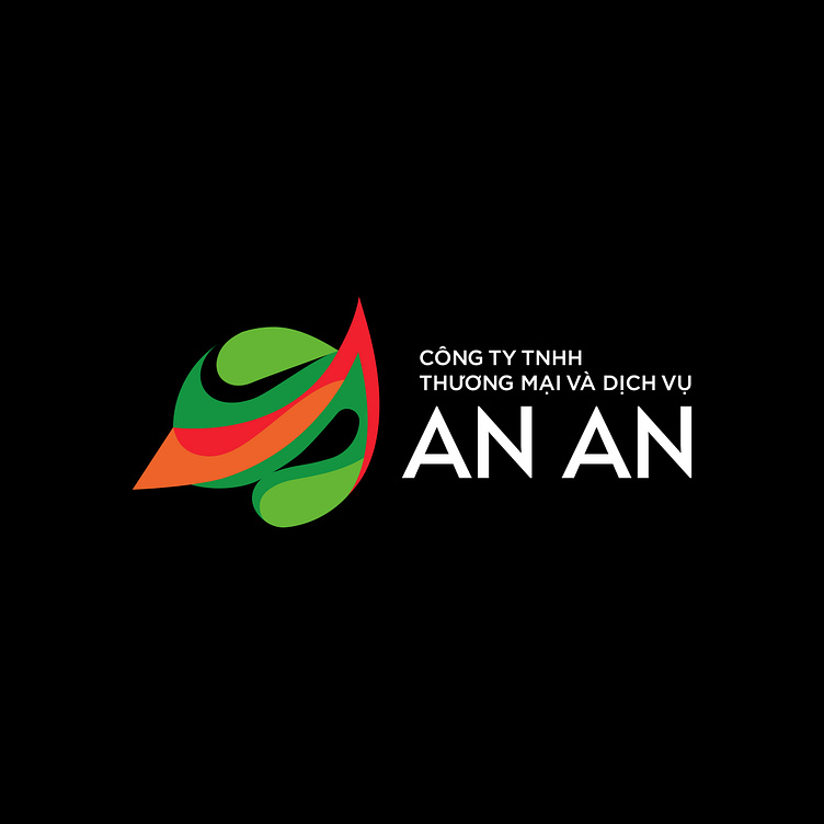
An An's brand identity is built on 3 criteria of professionalism, youth and modernity. With a combination of four colors of dark green, light green, red and orange, the overall identity is not only young, dynamic and full of vitality, but also conveys the core values that An An always pursues. The harmonious combination of these colors creates a unique and recognizable whole, reflecting An An's spirit and mission in providing quality, sustainable and customer-centric tourism and trade services.
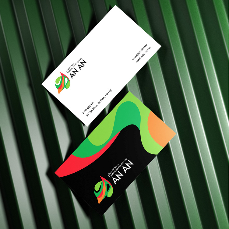
An An's logo design takes the image of the earth as a flying eyebrow as the main identification point to form a symbol with the letter "A" soaring high into the sky - showing globalization, integration, and tourism. The green, fresh earth with many twists and turns speaks to different cultures – in words that emphasize the diversity of businesses.
Designed by Bee Art
-
Client An An
Logo Design Project. Logo is designed for Tourism Company in Vietnam.
Copyright© Bee Art. All Right Reserved
Contact us:
• Hotline/ Zalo: (+84) 77 34567 18
• Email: info@beeart.vn
• Website: www.beeart.vn
• Facebook: https://www.facebook.com/BeeArt.vn