PALMERA | LOGO & BRAND
Palmera [Logo and Branding Project]
🟢 Logo | Branding | Brand Identity
🟢 Field: Hotel & villa
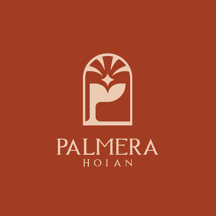
🎨 Palmera wants to design a logo: With the letter P and a tree
🎨 Palmera is a villa rental service business brand in Hoi An. Kaiza came up with the idea of designing a logo using symbols combined with the brand name. The logo was designed by Kaiza to stylize the letter P - the first letter of the brand name with an image of a palm tree resembling a window. The image of a 4-pointed star placed in the center creates the feeling of looking directly at the house. The font used by Kaiza is a classic, minimalist serif font that gives it a traditional yet modern look. The main earthy orange color brings positive energy and promotes luck and success for the brand. Overall, creating a simple, modern logo that represents the brand's business field.
Designed by Kaiza
Copyright © Kaiza. All Right Reserved
Contact us:
KAIZA CO.,LTD
• P: 0889 996 399
• E: info@kaiza.vn
• W: www.kaiza.vn
Connect me @ Behance - Instagram - Pinterest