Redesigning a Mobile Website

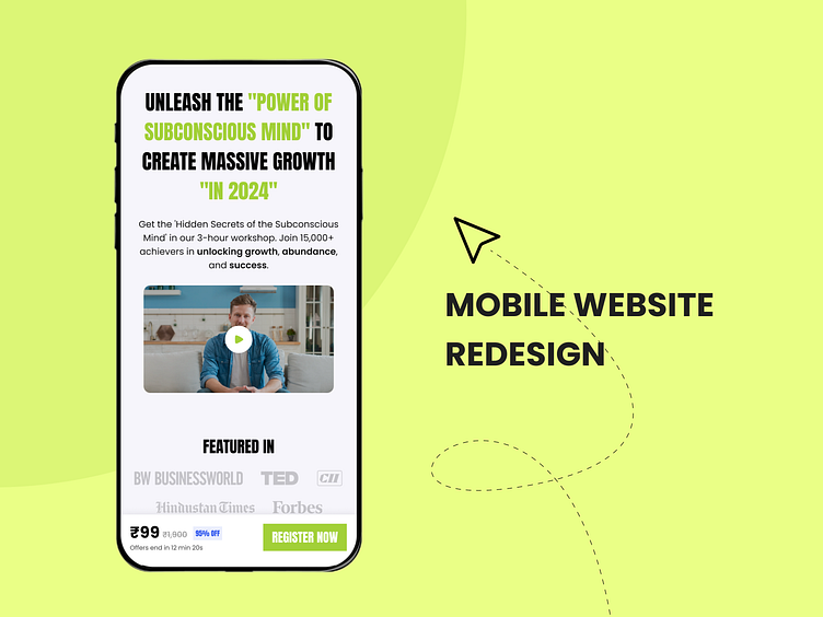
I found this course website which looked very ugly and I transformed it into something cool and elegant.
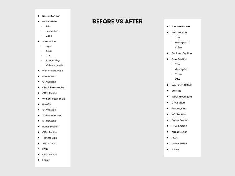
Redesigning Information Architecture
The website had issue- Too much information and not being in order. So, I redesigned the Information structure without losing it’s main purpose.
Color & Typography
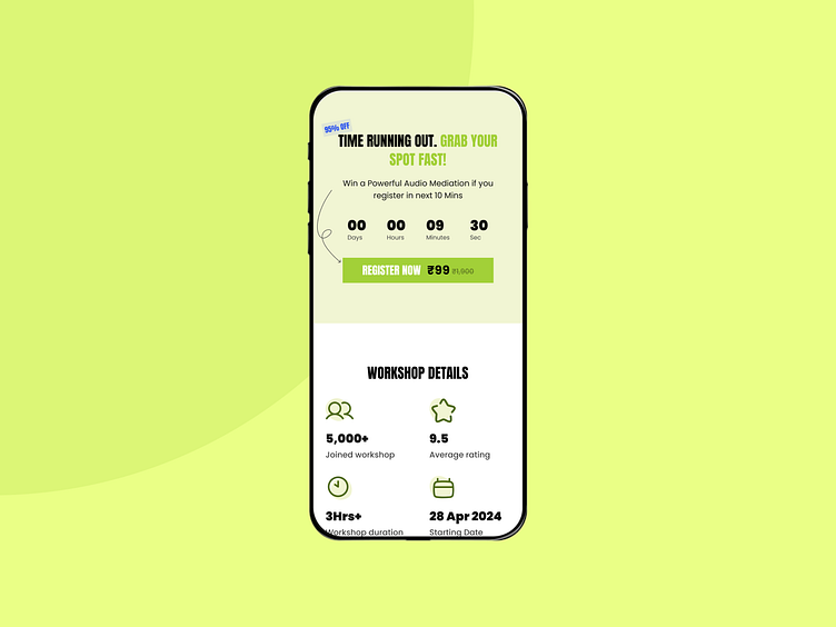
Choosing the right colors is crucial. Initially, the colors were purple and yellow. I decided to switch to green and black. Green signifies growth and health, which align perfectly with the theme of our webinar, "Reprogram Your Subconscious Mind."
I chose 'Anton' for the headings and 'Poppins' for the body text. The bold appearance of 'Anton' exudes empowerment and strength. Additionally, 'Poppins' offers clarity and readability, ensuring that users relate with the theme.
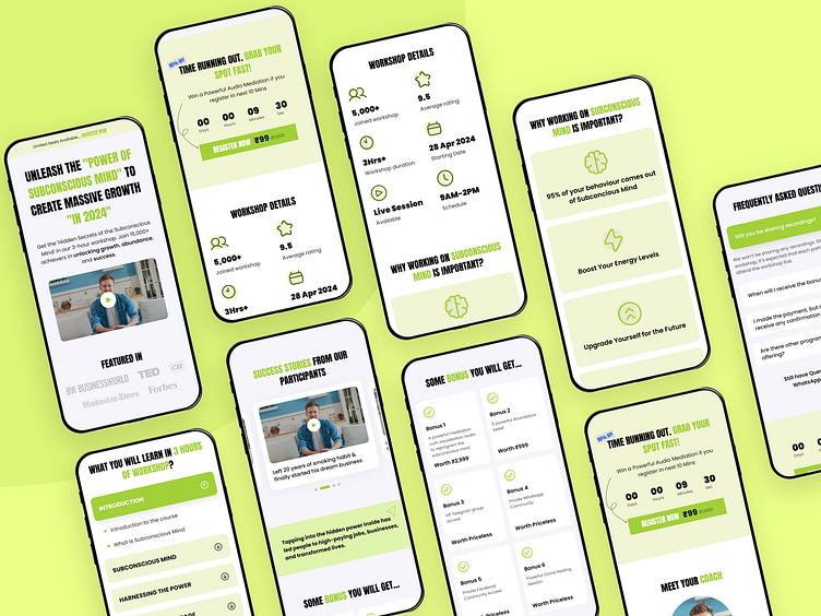
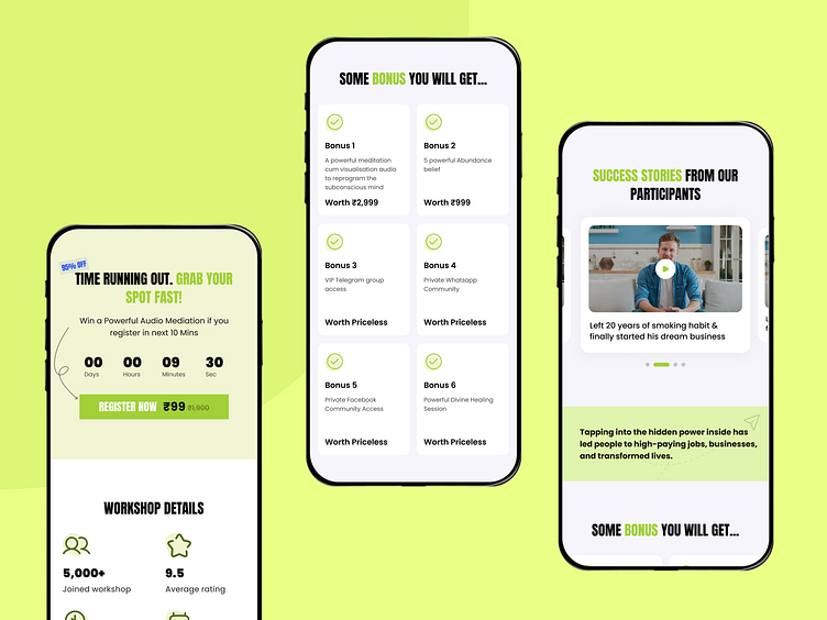
New UI- Layout, Buttons, cards, etc.
I totally redesigned the UI of Web design. Making layout unique and easy for users to navigate, giving consistency in the design.
Made the Button trendy, Card with the rounded corners & beautiful icons. Made things clean, readible and fun.
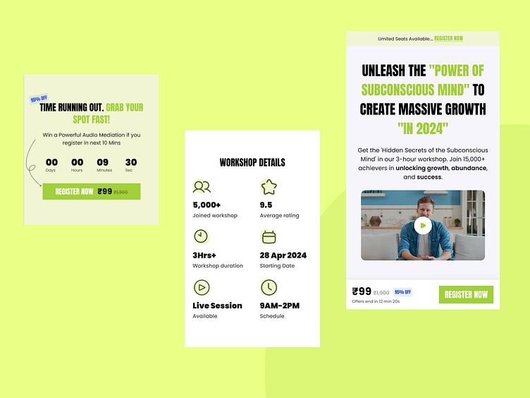
Conversion rate
I carefully designed the website to boost our conversion rates. Before, we had CTA buttons everywhere, almost after every section. I simplified this, reducing the number of CTAs, but that didn't mean fewer conversions. In fact, the previous setup might have felt pushy, always urging people to register for the webinar. Now, it's more about building trust and rapport, not forcing registrations. Even with this softer approach, our new design is still driving strong conversion rates, showing that trust and authenticity are key drivers of action.
Thank You for Watching. ✌✌