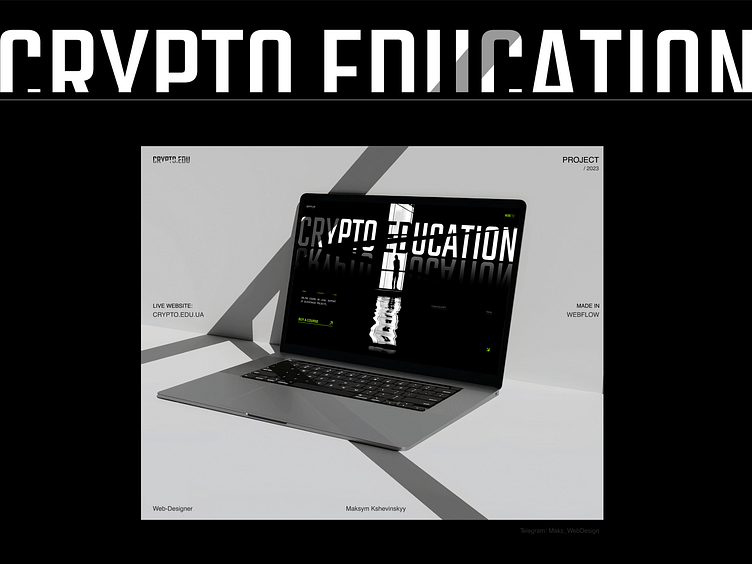
_Premium Web Design: CRYPTO EDUCATION
Hi )
--
I continue to share this case and now we are looking at the animation of the Landing Page - CRYPTO EDUCATION.
- To attract the user's attention, we made a cool animation on the main screen. Then there is also an animation to increase attention to the content, and the user can warm up with our blocks and leave a request.
- On the marketing side, we have developed a high-quality website structure
to describe each block in detail.
More by Maks Kshevinskyy View profile
Like
